Product-Led Growth
2022–2024 · User Researcher & Designer · PLG Research · Adoption Strategy
Research that shifted the PLG story from feature push to connectivity and deployment size. Adopted by Customer Success and marketing.
Context
The PLG initiative
Onomondo pursued a Product-Led Growth motion to drive upgrades and expand usage on its self-service SIM platform. Free login opened the platform to prospects. Users could browse the connectivity tools and order SIMs to test.
The initial upgrade motion: feature advertising banners, content blocking, contact forms.
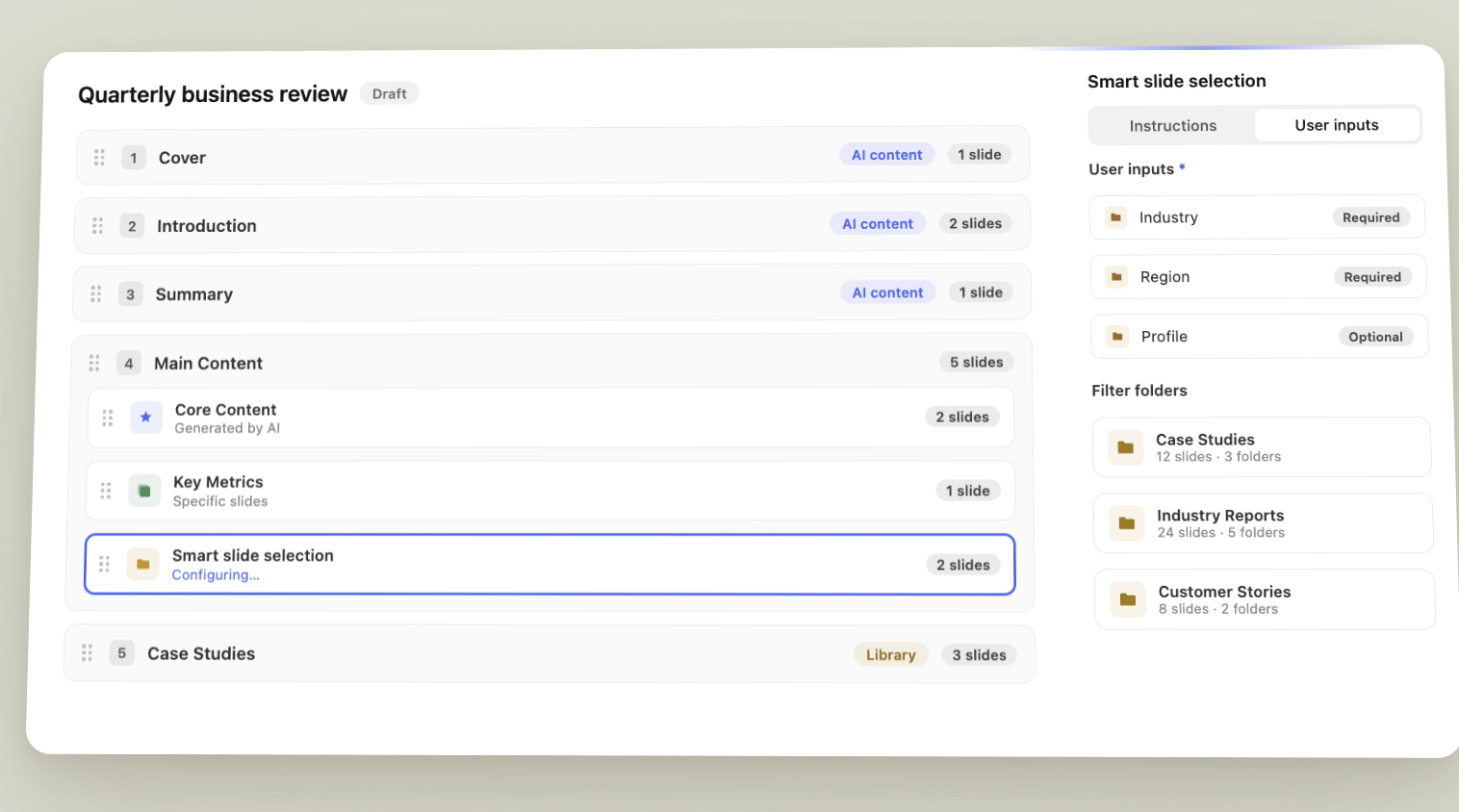
Design focus: the landing dashboard.
Exploration
Log in screen
Four themes tested against the create-account form.
Connectivity map led
Lead with the global IoT network marketplace. Show coverage and reach next to the create-account form.
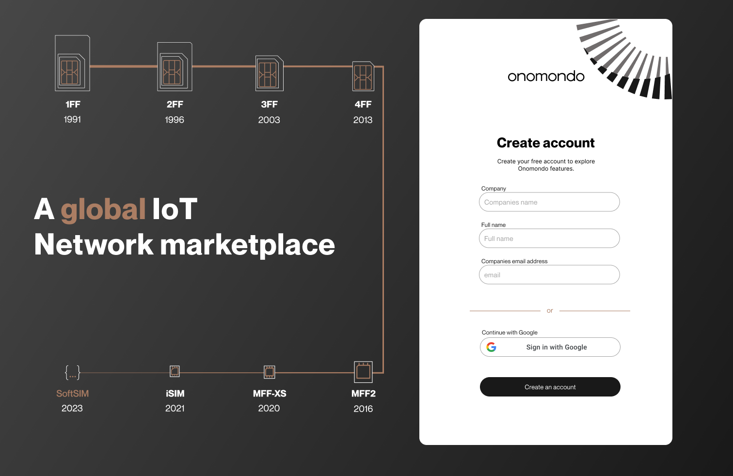
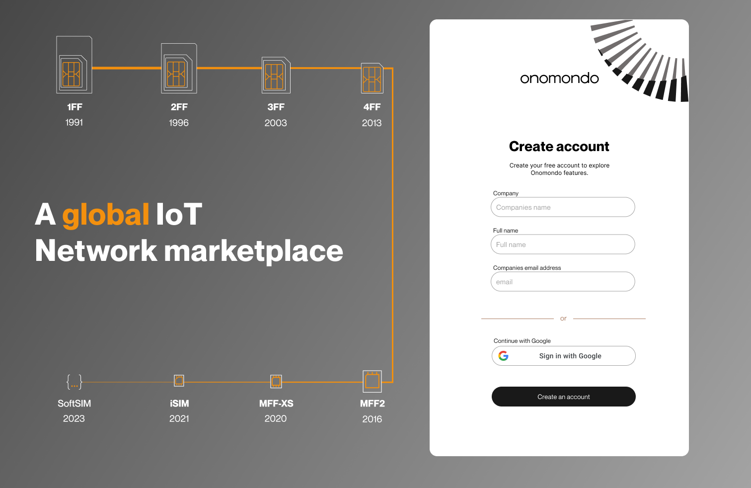
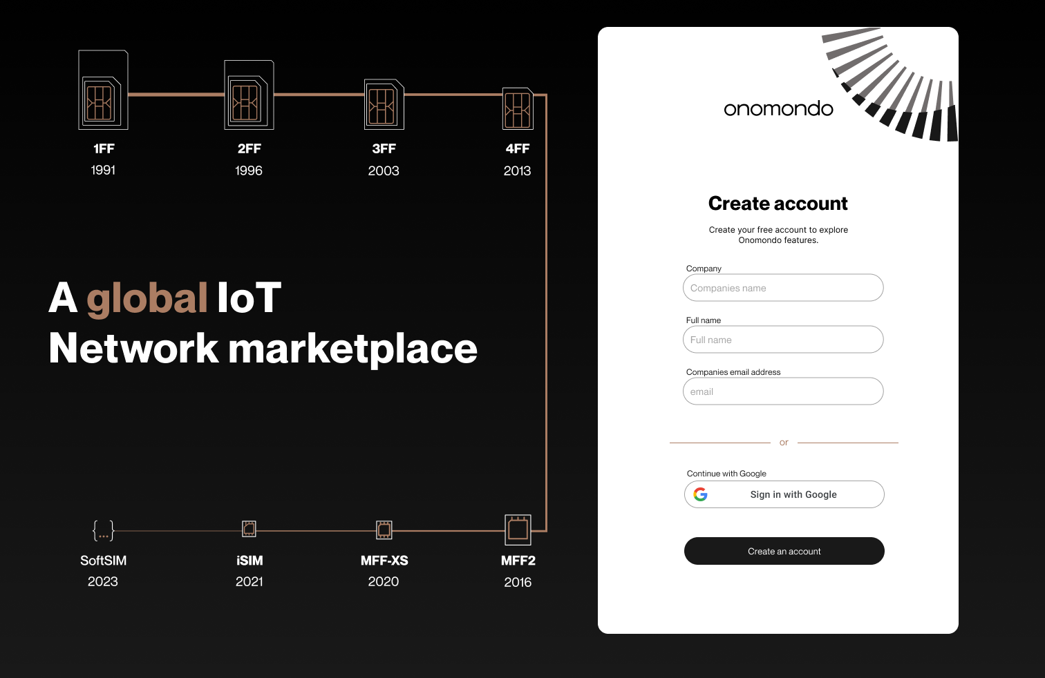
SIM factor led
Lead with the form-factor timeline: 1FF through SoftSIM. Show the product's full range next to the create-account form.
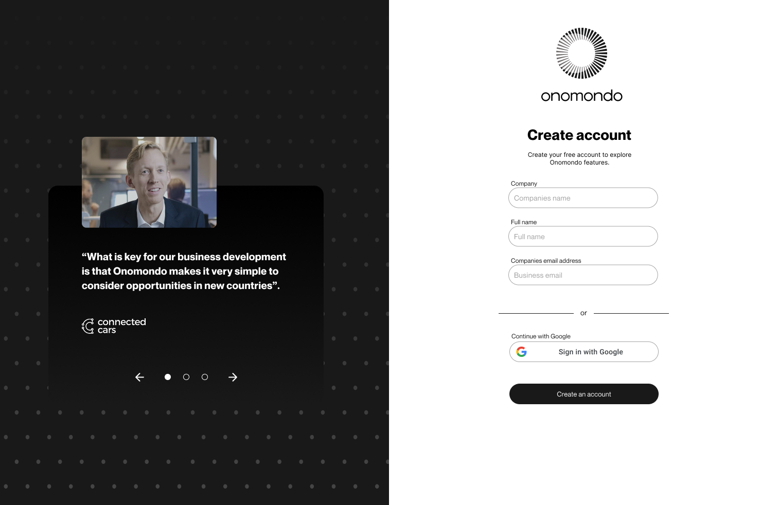
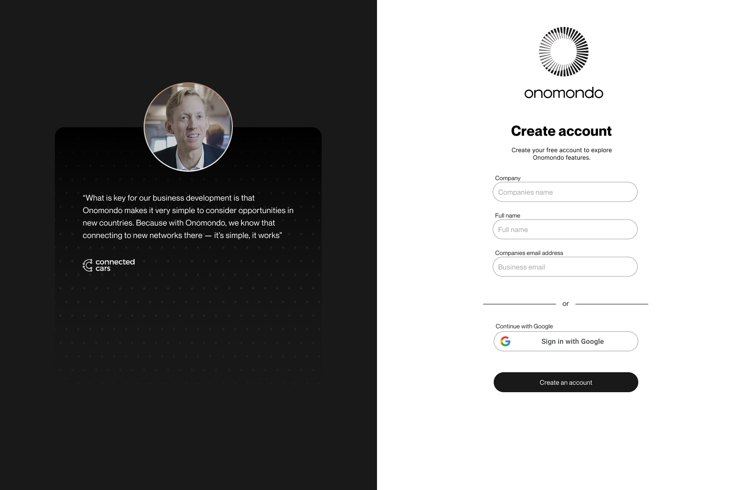
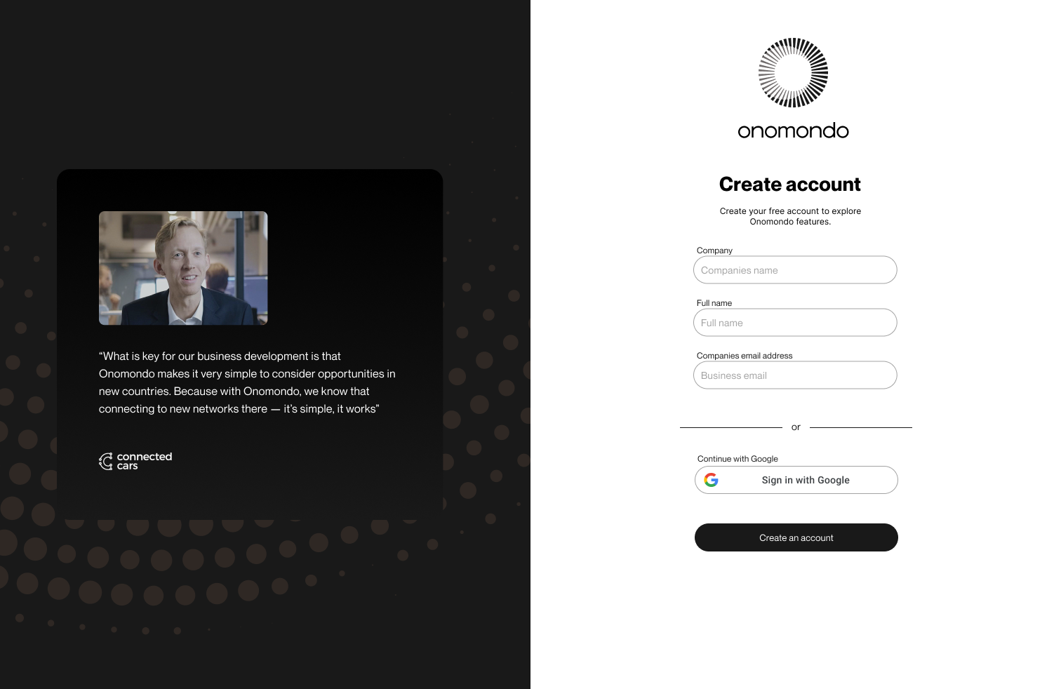
Social proof led
Lead with a customer quote from Connected Cars. Credibility from a real deployment instead of the product pitch.
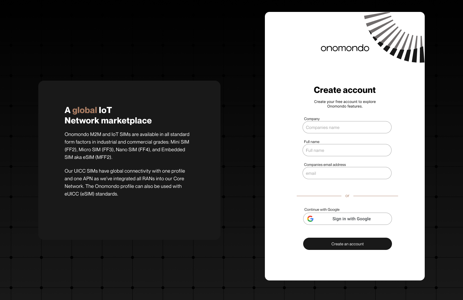
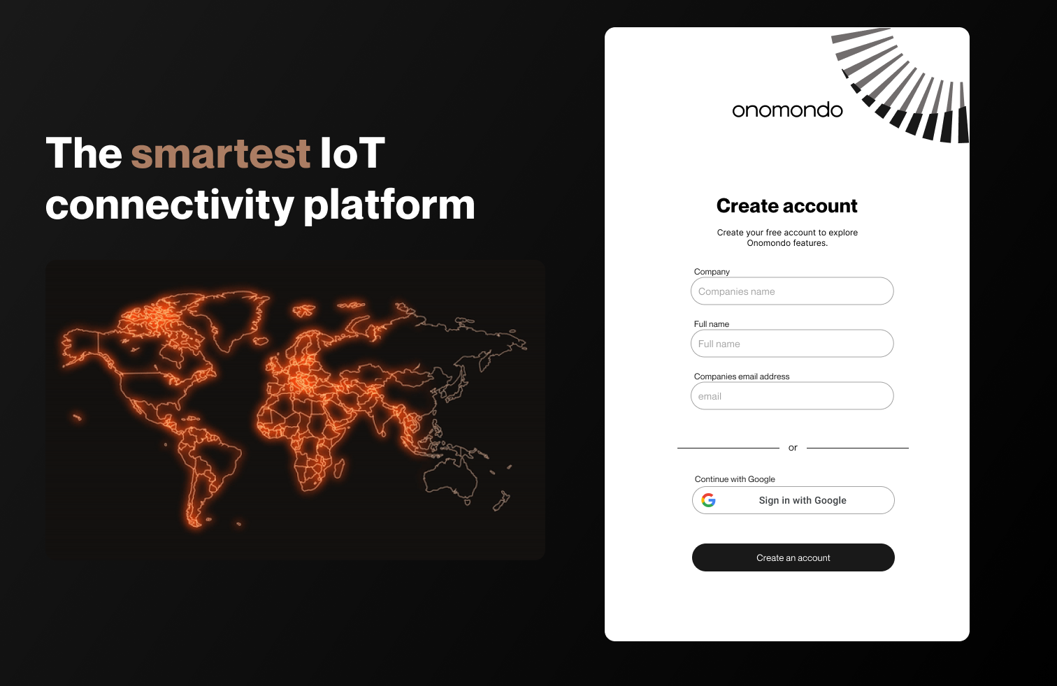
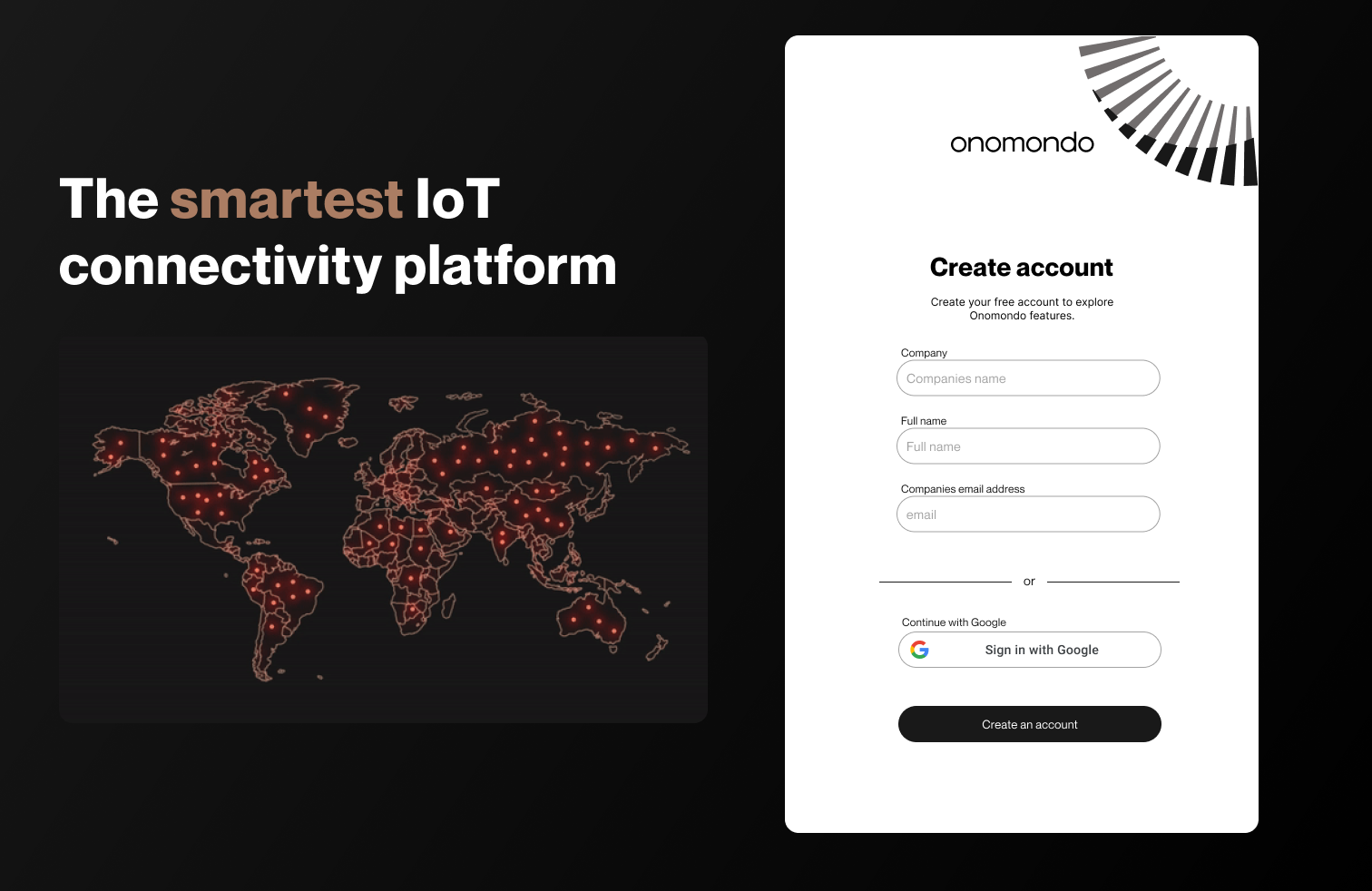
Map and network marketplace led
Focus on the map and network marketplace alongside the create-account form. Matched the marketing message and the global focus.
Research
Understanding customers
I stepped back from the push motion and asked who the real customer is on this platform. Cohort analysis of 23 customer organisations and 71 active platform users.
Two user profiles
Profile 01
The Trial User
- Looking for instant connectivity
- Motivated by price advantage in a very specific, isolated use case
- Evaluating the product, not investing in it
- Needs: fast activation, instant proof of value, low friction
Profile 02
The Scaling User
- Deploying 5,000 to 50,000 devices per year across verticals like asset tracking, micro-mobility, industrial sensors, smart farming and shipping
- Small cross-functional teams: support engineers, software engineers, project managers, CTOs, hardware engineers
- Heavy API and webhook users integrating connectivity into internal systems, not evaluating a dashboard
- Building operational tools, not testing a solution
- Needs: control, bulk actions, network list management, device-level visibility, reliable data piped into their own systems
Different definitions of value. Different willingness to pay.
Usage data
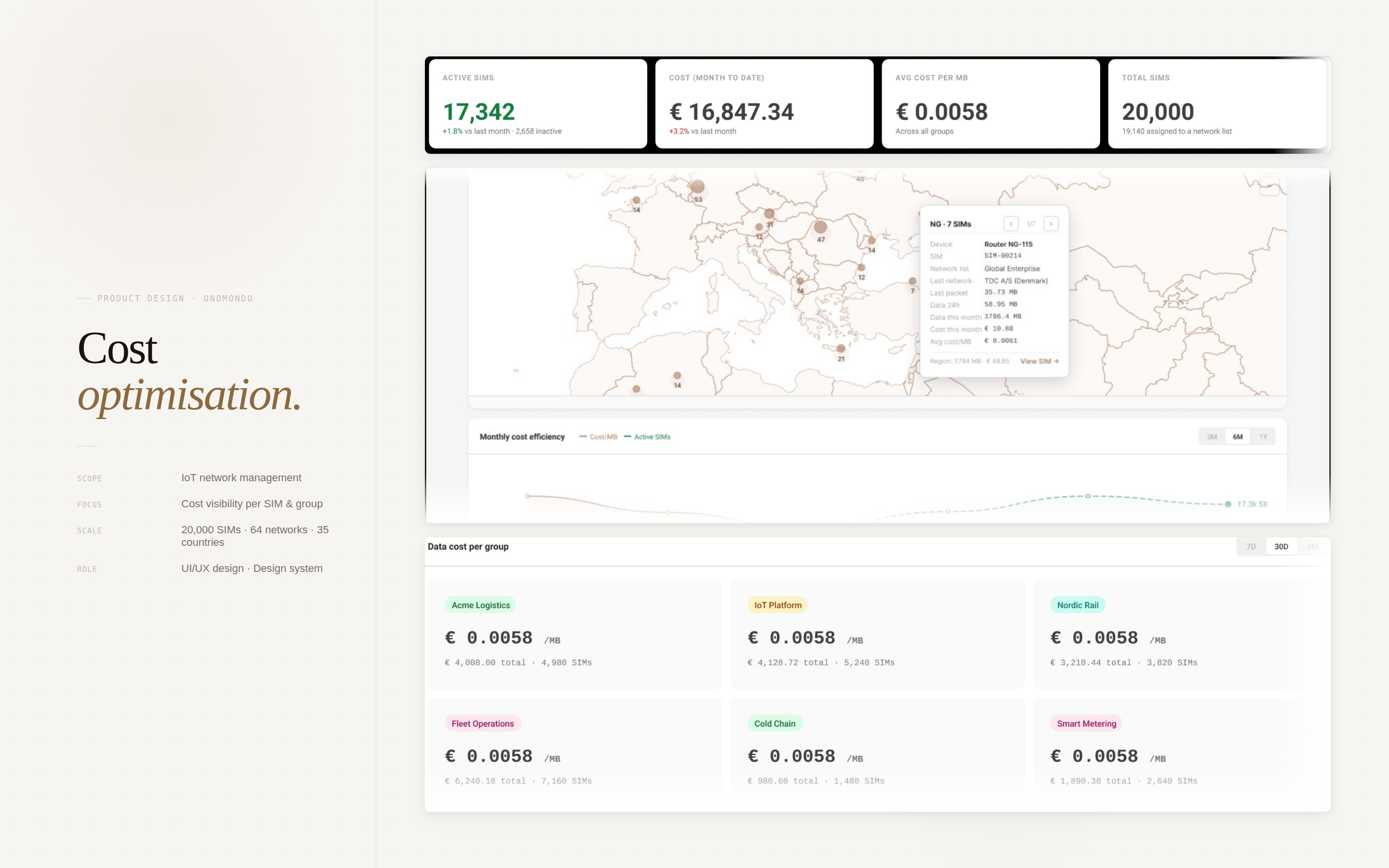
What scaling-user behavior actually looks like
Patterns from the cohort contradicted the assumption users were passive.
- Nearly half of all SIM update API calls platform-wide originated from mid-market customers in the last twelve months.
- 17 of 23 companies had active API keys making calls at least every six months.
- 8 of 23 were piping webhook events into their own internal systems.
- Around 50% of SIM updates made via the dashboard came from this segment.
In smaller organisations, where C-level was very hands-on, different roles within the same customer used the platform differently. Support engineers lived in the SIMs table and Traffic Monitor. Software engineers opened single SIM pages directly from links in their own tools. CTOs checked network lists and created API keys. CEOs updated SIMs themselves more often than any other role. Hardware engineers opened the specific SIMs that needed attention, bypassing search entirely.
These users were not browsing. They were operating. The interface was a control panel wired into their day-to-day work, not a showcase waiting to be explored.
Inflection point
When complexity becomes value
Successful customers showed a clear pattern. They had created multiple custom network lists. As they expanded geographically or operationally, they created more: specific devices connecting to specific networks in specific business areas.
This was the inflection point. The moment a customer's connectivity needs became complex enough that manual management broke down was the moment the platform became genuinely valuable to them. That was when they were willing to pay for more.
The PLG motion was optimised for the trial user, who rarely reaches that inflection point. It was almost entirely ignoring the scaling user, who does.
Who uses is not always who buys
The research also revealed a third dimension: who actually uses the platform is not always who decides to buy it.
Decision maker
Technical leadership / procurement
Cares about cost, reliability, scalability, security.
Daily user
IT admin / network manager
Cares about control, visibility, speed of configuration.
End device user
The person whose device connects
Does not know the SIM exists. Just needs it to work.
Designing for one of these people while ignoring the others breaks the entire experience.
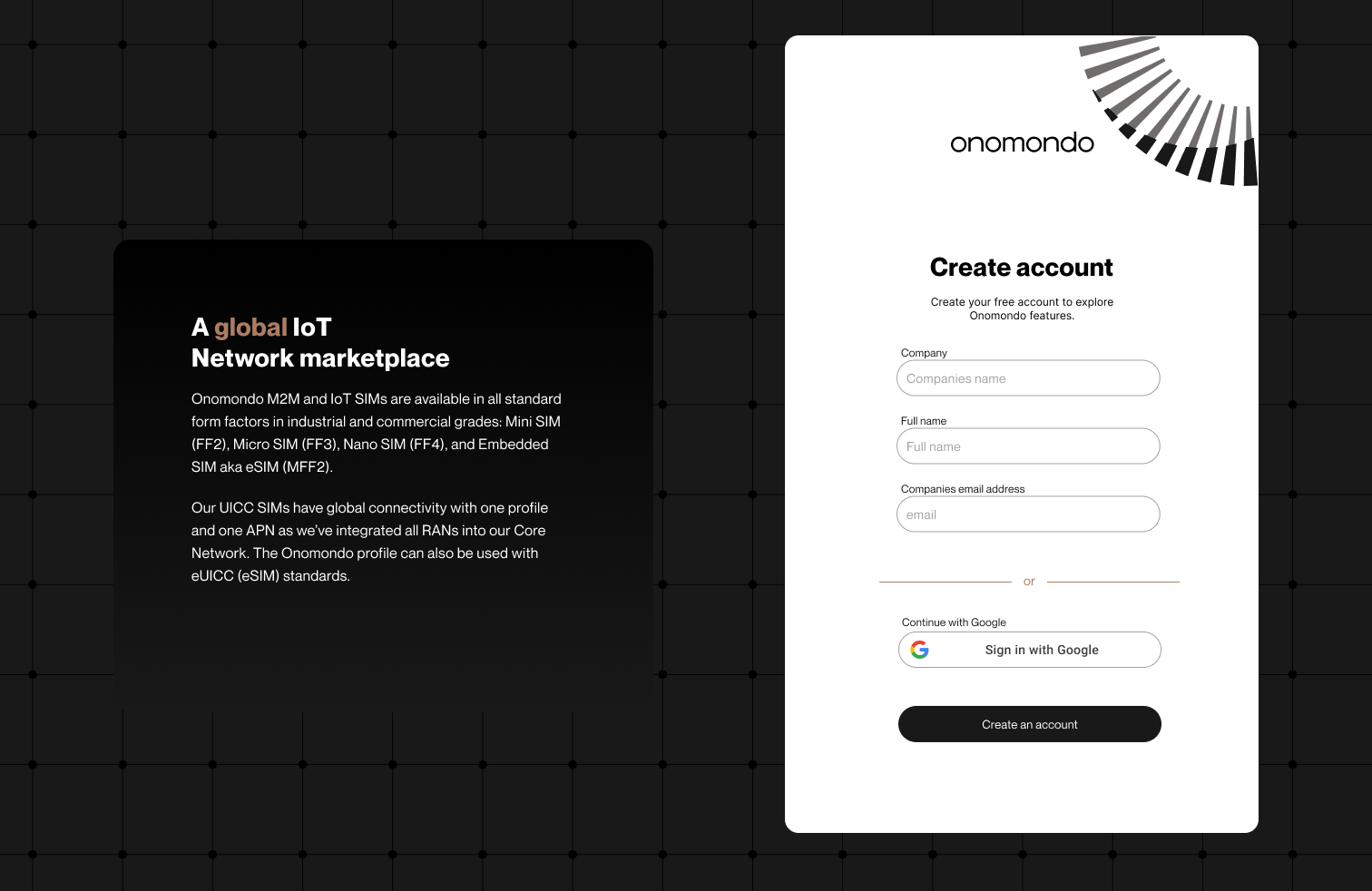
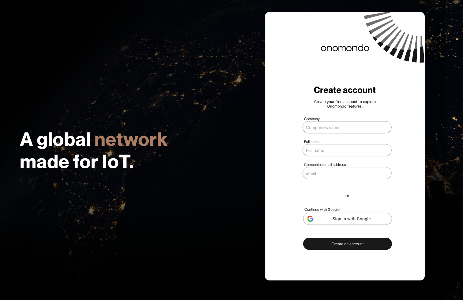
Chosen
Single global network
Informed by the research. Resonated best with sales and marketing. Carried forward.
"The smartest IoT connectivity platform" with a glowing global network map, next to the create-account form.
Buying SIMs in the platform
Empty state
Free trial user has access to Platform
Users see an empty app.
No features. No activity. Zeroes across every metric and a Fleet upgrade banner where the map should be.
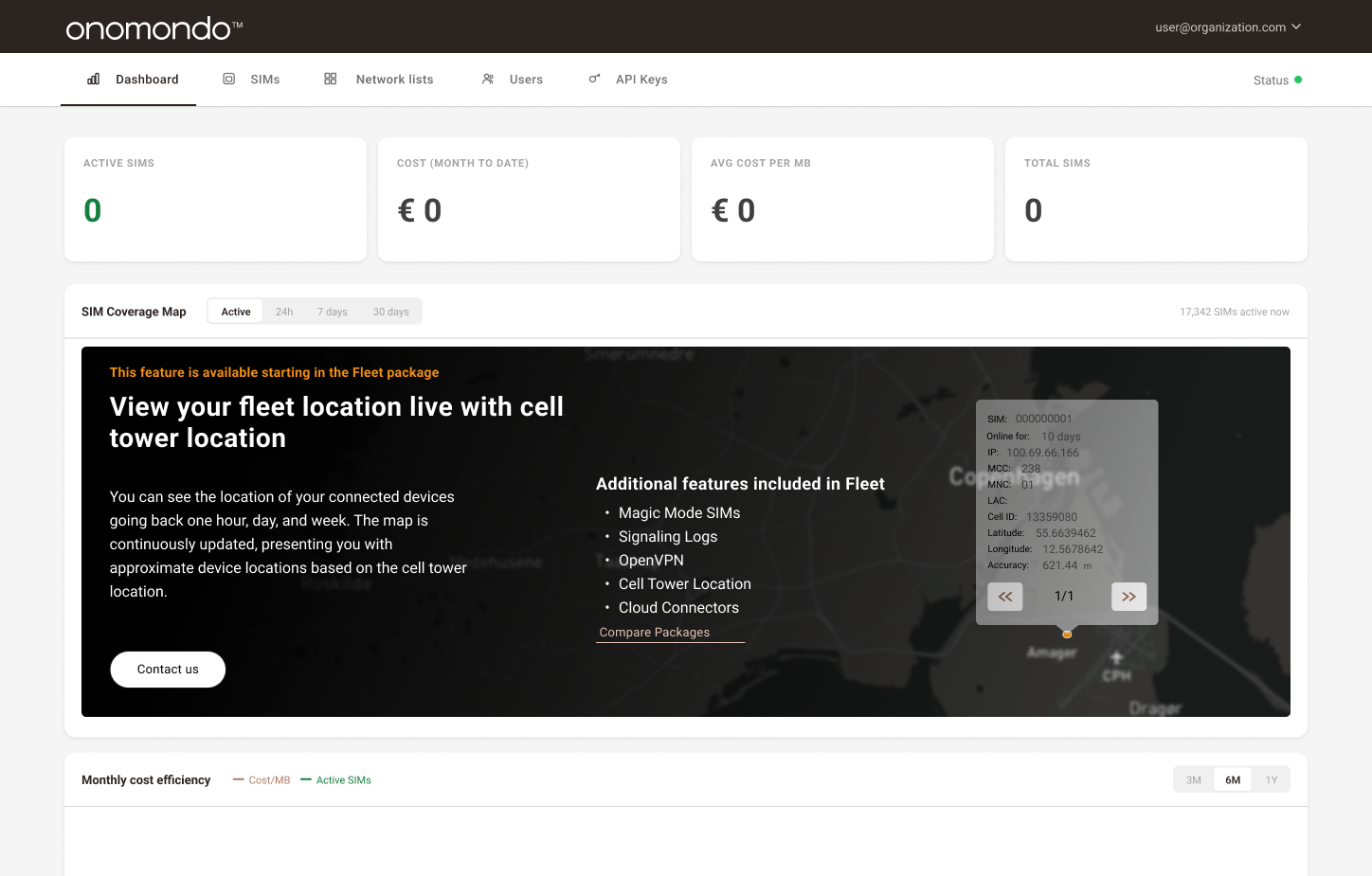
Zeros across the top, upgrade banner covering the map. Nothing to act on.
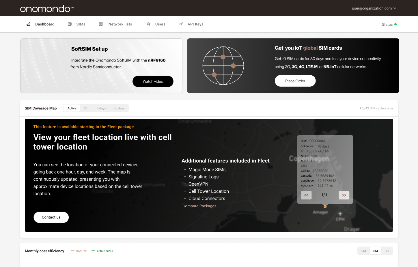
The empty state was where users ordered SIMs. Place Order, 10 cards for 30 days.
Platform
Feature breakdown and presentation
The PLG motion succeeds by placing an upgrade moment on the page each role already needs. Support engineers meet the Pro gate in Traffic Monitor. CTOs meet the Pro gate on API keys. Software and hardware engineers meet the Fleet teaser on SIM detail. CEOs meet the Fleet cross-sell on Dashboard.
The account upgrades when any one of these roles converts their moment, which means role coverage is the growth lever, not overall visit count.
Keep users informed about key features and what unlocks them

Dashboard · Fleet cross-sell. CEOs meet the upgrade moment here.
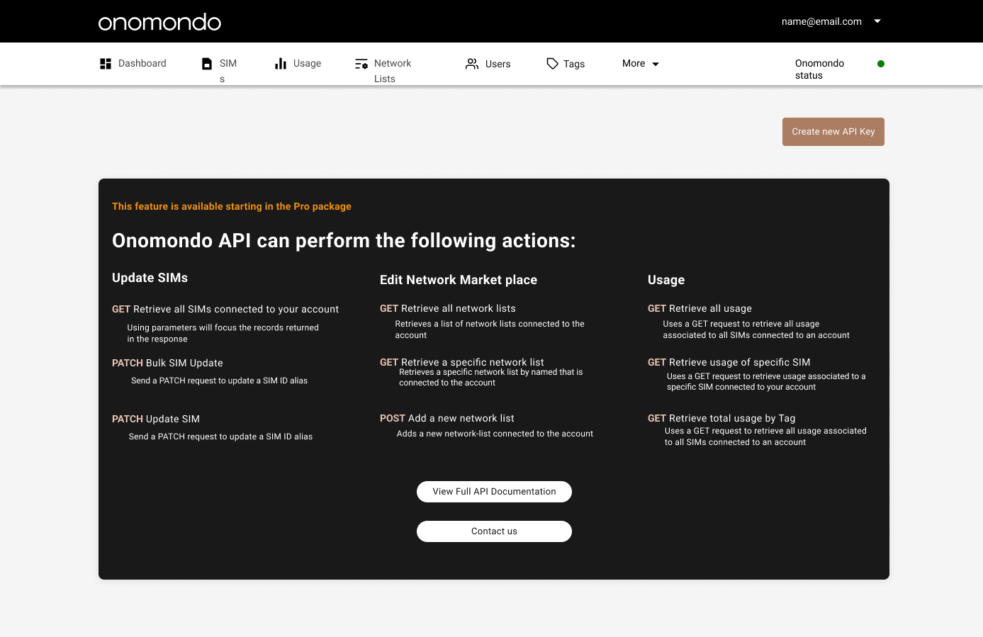
API Keys · Pro gate. CTOs meet the upgrade moment here.
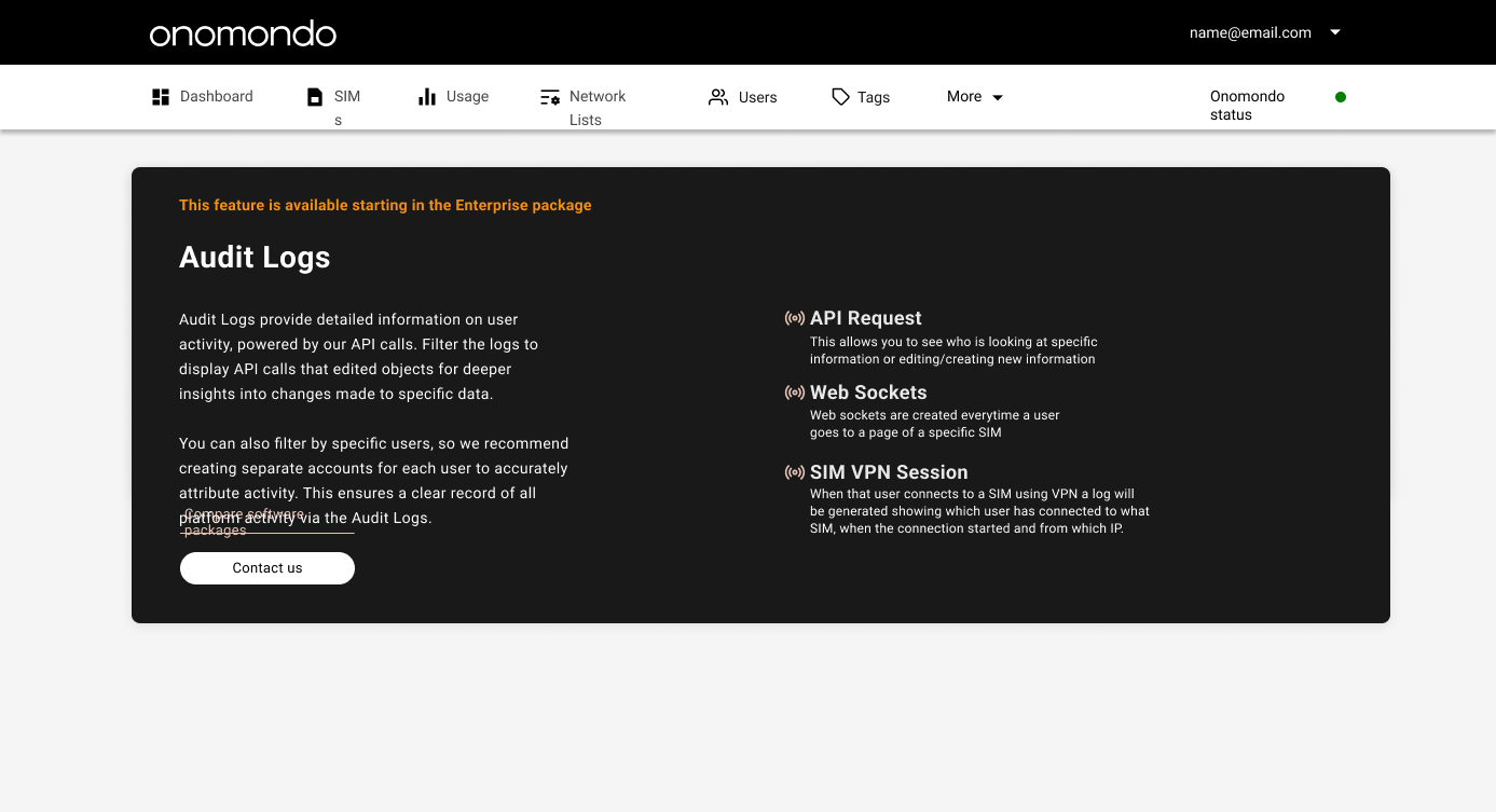
Audit Logs · Enterprise gate for activity tracking.
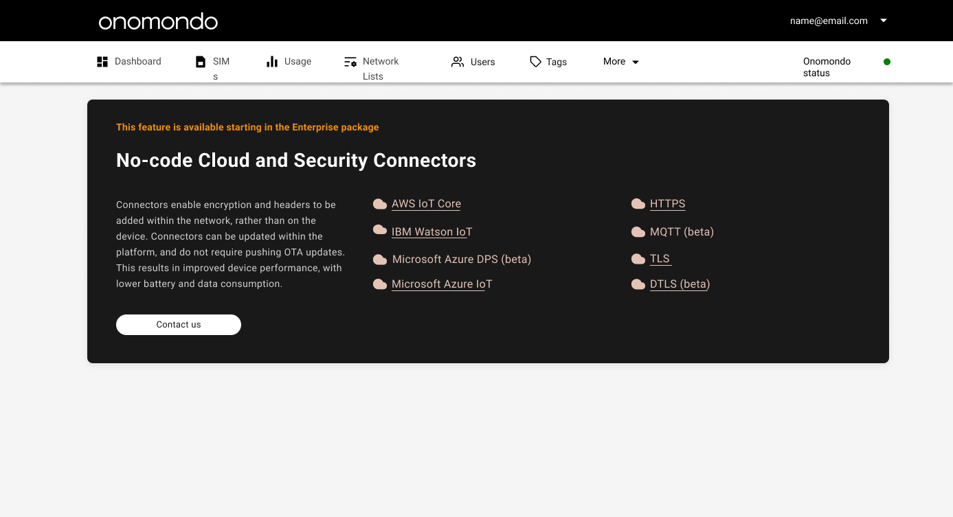
Connectors · Enterprise gate for cloud and security integrations.
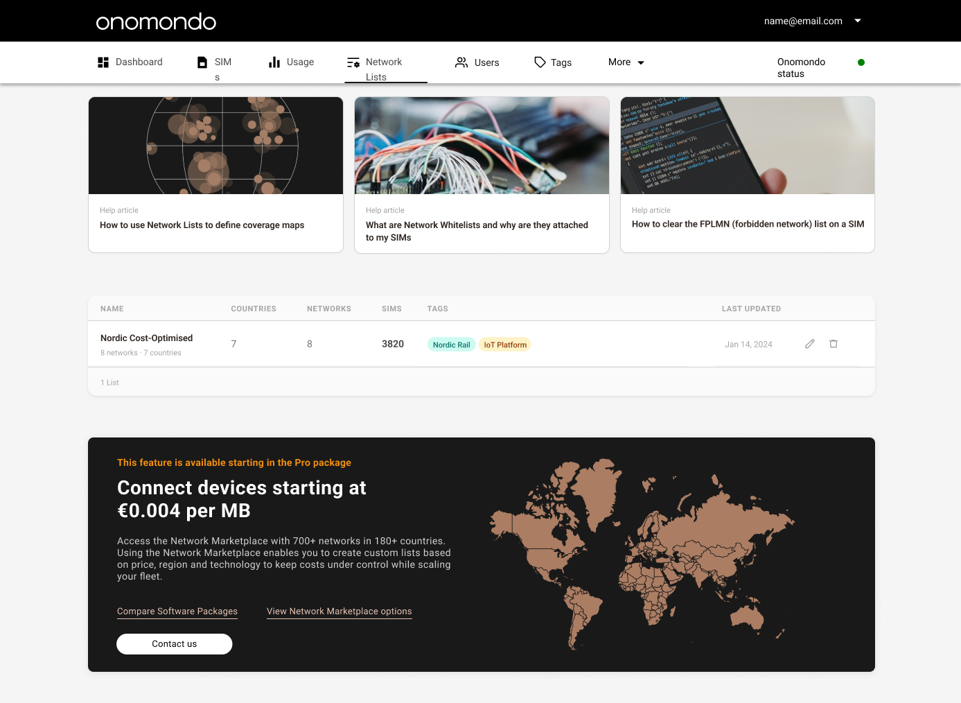
Network Lists · Pro gate for the Network Marketplace and custom coverage maps.
Platform
Developer features
Surfaces where software, hardware and support engineers already work. Each page carries its own upgrade moment, tied to the task the role is trying to complete.
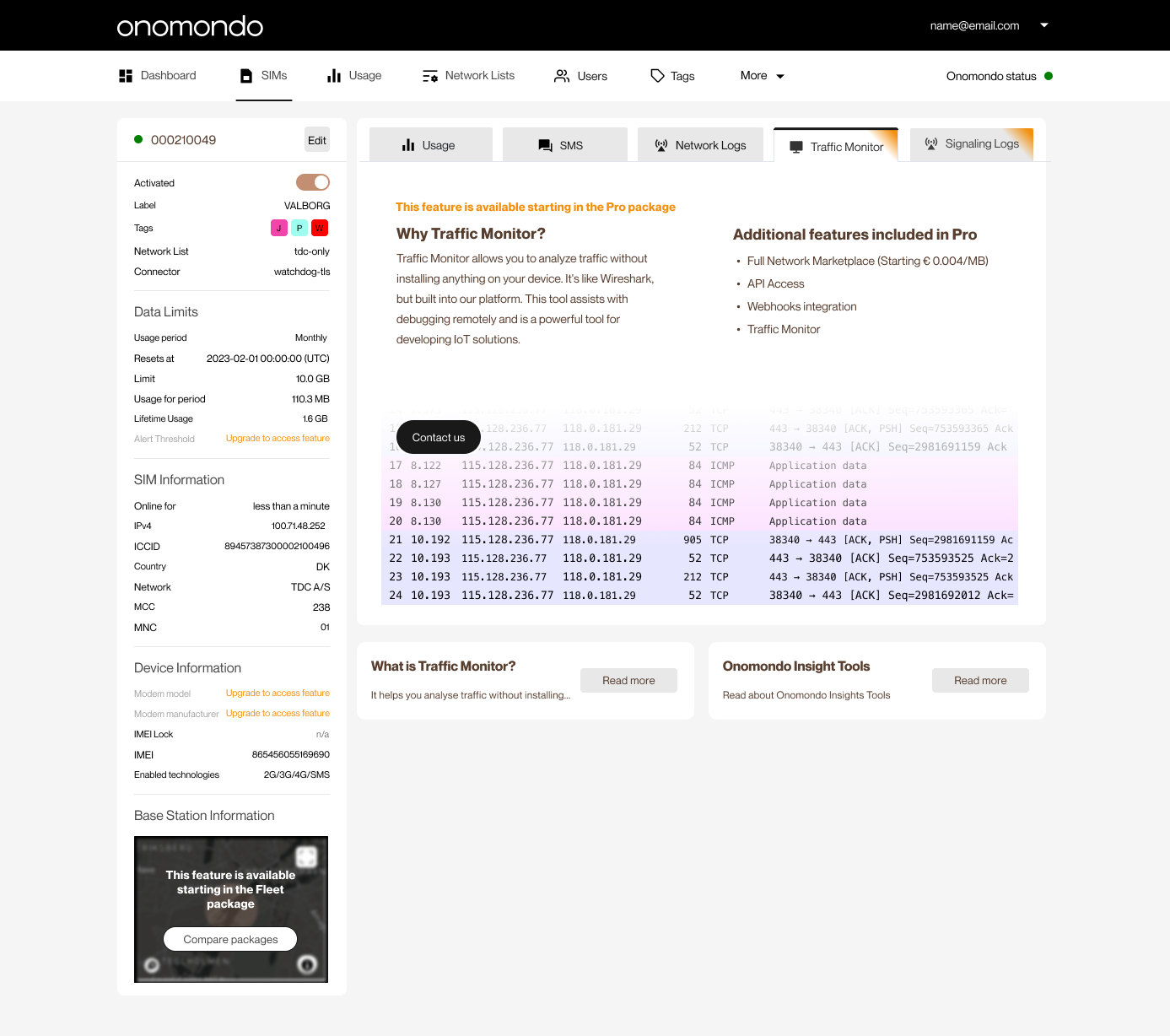
Traffic Monitor · Pro gate. Wireshark-style traffic inspection on any SIM. Support engineers meet the upgrade moment here.
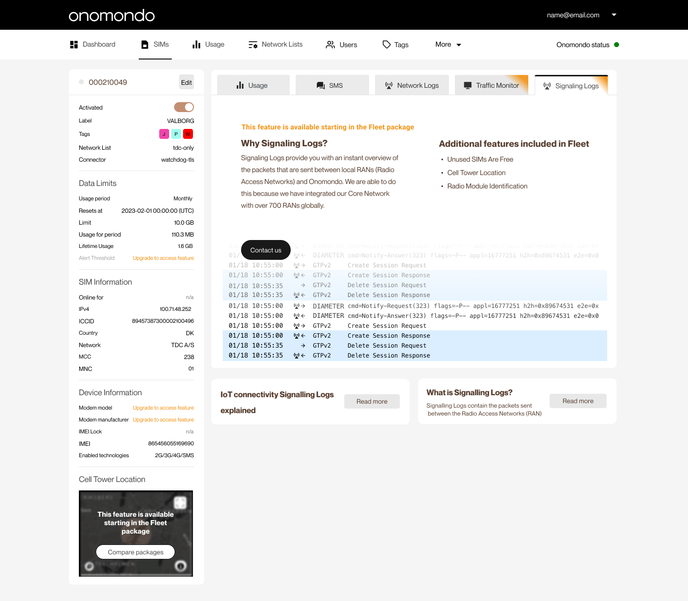
Signaling Logs · Fleet gate. RAN-level packet visibility for deeper debugging.
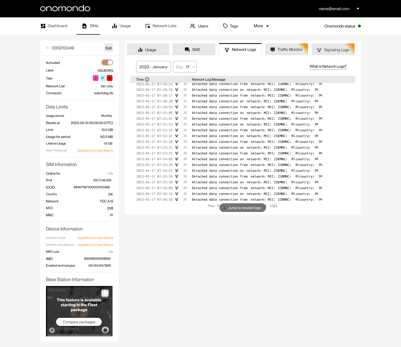
Network Logs · Attach and detach events, by SIM and timestamp. Software and hardware engineers open single SIM pages directly from links in their own tools.