Electronic TV Guide
Redesigning IPTV navigation for smartphones, making content discovery feel natural on a small screen.
Context
Why the EPG needed to change
EPGs were designed for TV sets. Mobile usage was growing, but the existing interface had never been optimised for phones.
This was a commercial problem. Operators were choosing competitors because Nordija's EPG had no credible mobile experience. The company needed a redesign.
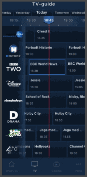
The existing grid-based EPG designed for TV, not for touch
Research
Users think by genre, not channel
The central finding from an online survey of 140 respondents across age groups in Denmark: people look for content by genre — Sports, Films, News — not by navigating a channel list. The EPG was built around channels. That was the wrong primary axis.
The phone was already the primary tool for finding content, even when people watched on a different screen.
Users described searching for "something to watch" in terms of genre first — "I want a film" or "is there any sport on?" — not by channel. The channel-based grid was a navigation mismatch with how users actually think.
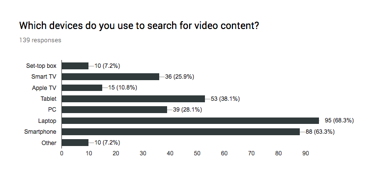
89.3% of respondents owned a smartphone, making it the most common device after laptops (90%). Yet the EPG had no mobile-optimised experience.
63.3% used their smartphone to search for video content. The phone was the second most-used search device, just behind laptops (68.3%).
Only 33.8% watched content on the same device they searched on. 48.9% said "sometimes." People browse on their phone then watch on a bigger screen.
43.9% found new content by browsing the channel list, and 61.2% relied on recommendations. The EPG was still a key discovery tool, but needed to work better on mobile.
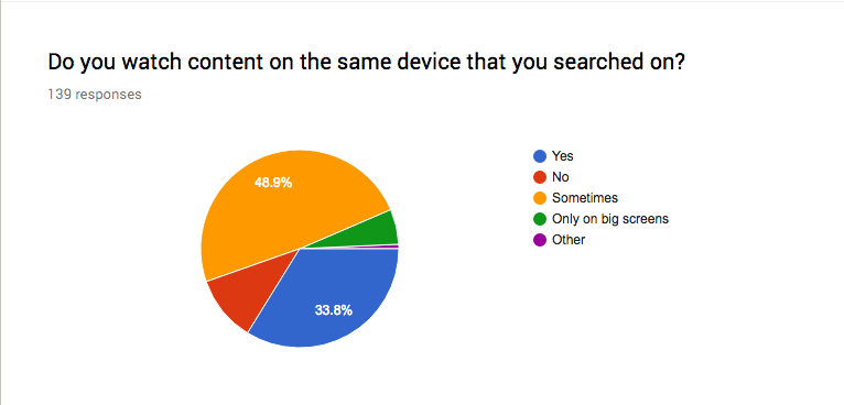
Survey data: smartphones are a primary search device (left), but most users watch on a different screen (right)
Problem
Six usability failures
A heuristic evaluation of the existing EPG identified six usability failures.
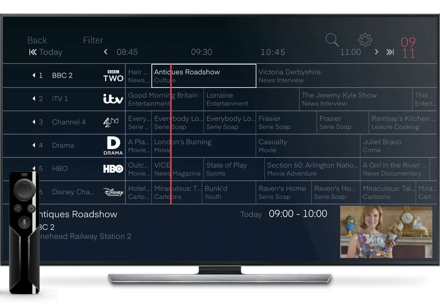
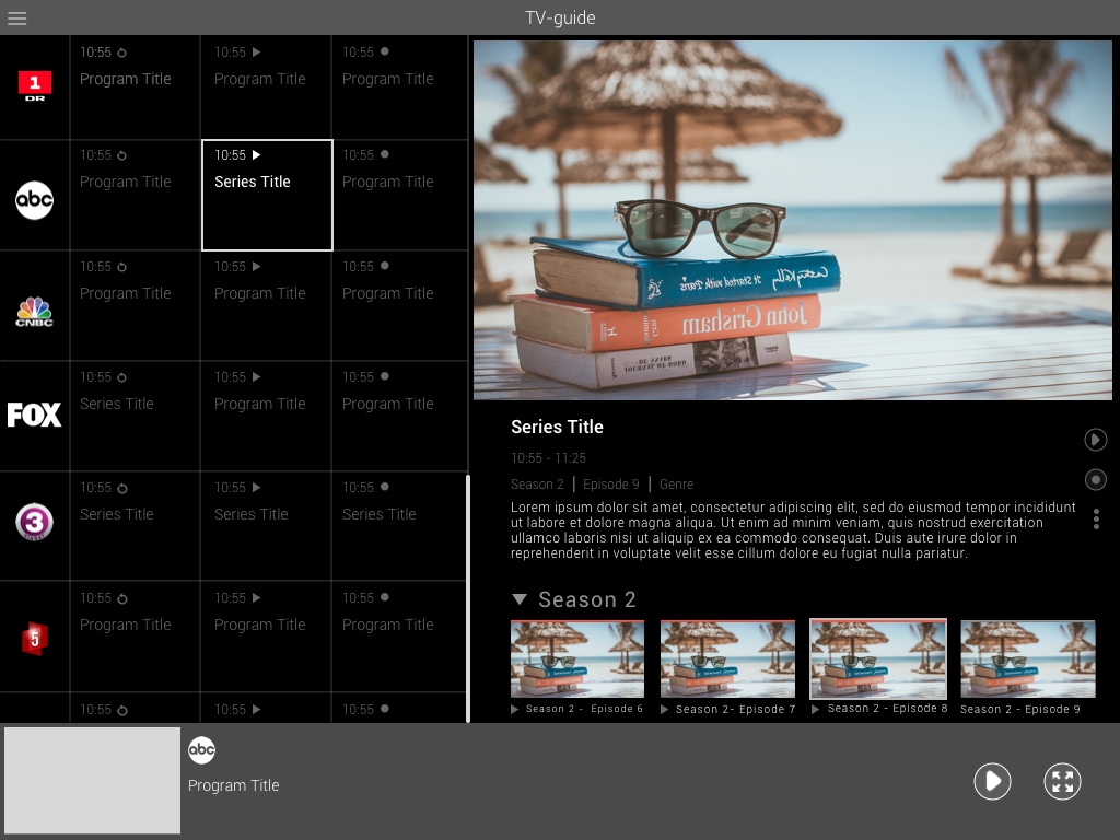
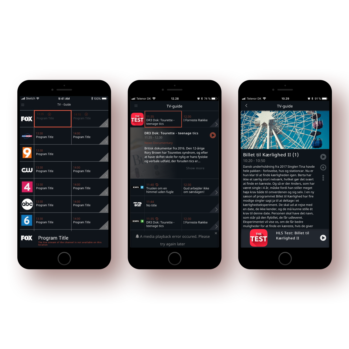
Existing EPG experience on TV (left) and tablet (right), neither optimised for phone interaction
No clear feedback on the user's position within the timeline. Users couldn't tell where they were or how much of a programme had aired.
Users lacked meaningful control when navigating within the timeline, relying entirely on arrow buttons ill-suited to touch interaction.
Inconsistent feedback and interaction patterns across different screen sizes and device types created an unpredictable experience.
No mechanism to prevent users from accidentally navigating away from the current timeline position with no easy way back.
Users were required to recall their position in the timeline without visual cues, placing unnecessary load on working memory.
The interface was cluttered with unnecessary elements, making it difficult to scan for relevant content quickly.
Design Exploration
Testing gesture and layout models
Users understood the grid. The challenge was making it work for a thumb instead of a remote, on a much smaller screen.
People already swipe, pinch, and pull to refresh on their phones. The EPG ignored all of that, using arrow buttons from the TV remote. Three gesture models were wireframed: horizontal swipe, time-slot tapping, and vertical scrolling.
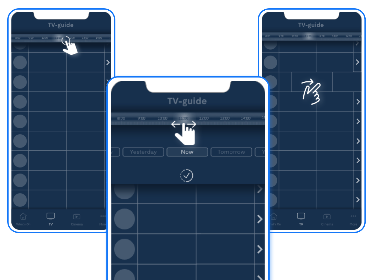
Mobile wireframes: testing swipe, tap, and scroll models against familiar phone interaction patterns
Another exploration tested genre filtering within the guide (Sports, Series, News, etc.). Discarded: the filter overlay competed with the app navigation and confused the hierarchy.
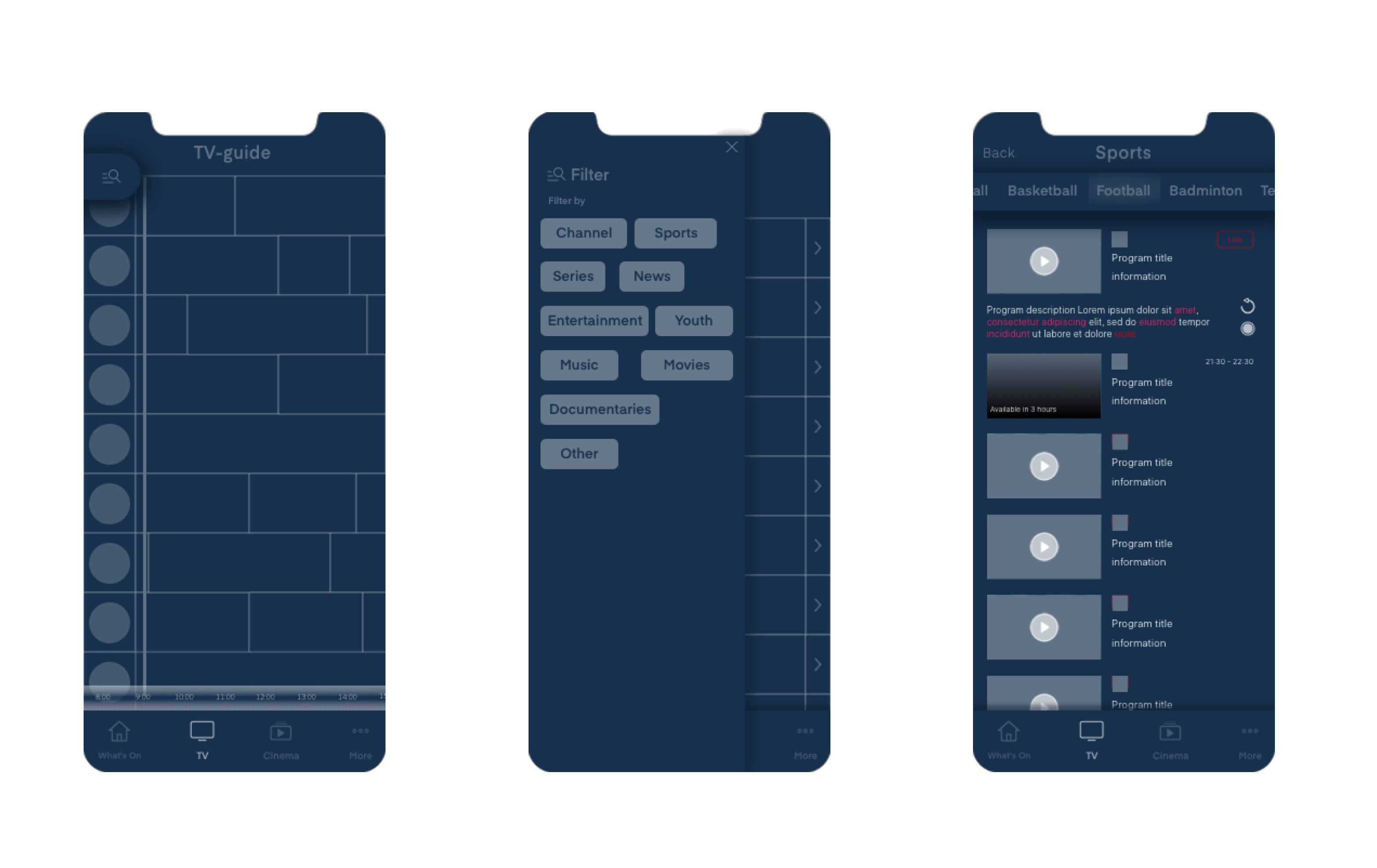
Discarded: the filter overlay competed with app navigation. Genre-based browsing was validated in research but scoped as a separate workstream
User Testing
Four findings from usability testing
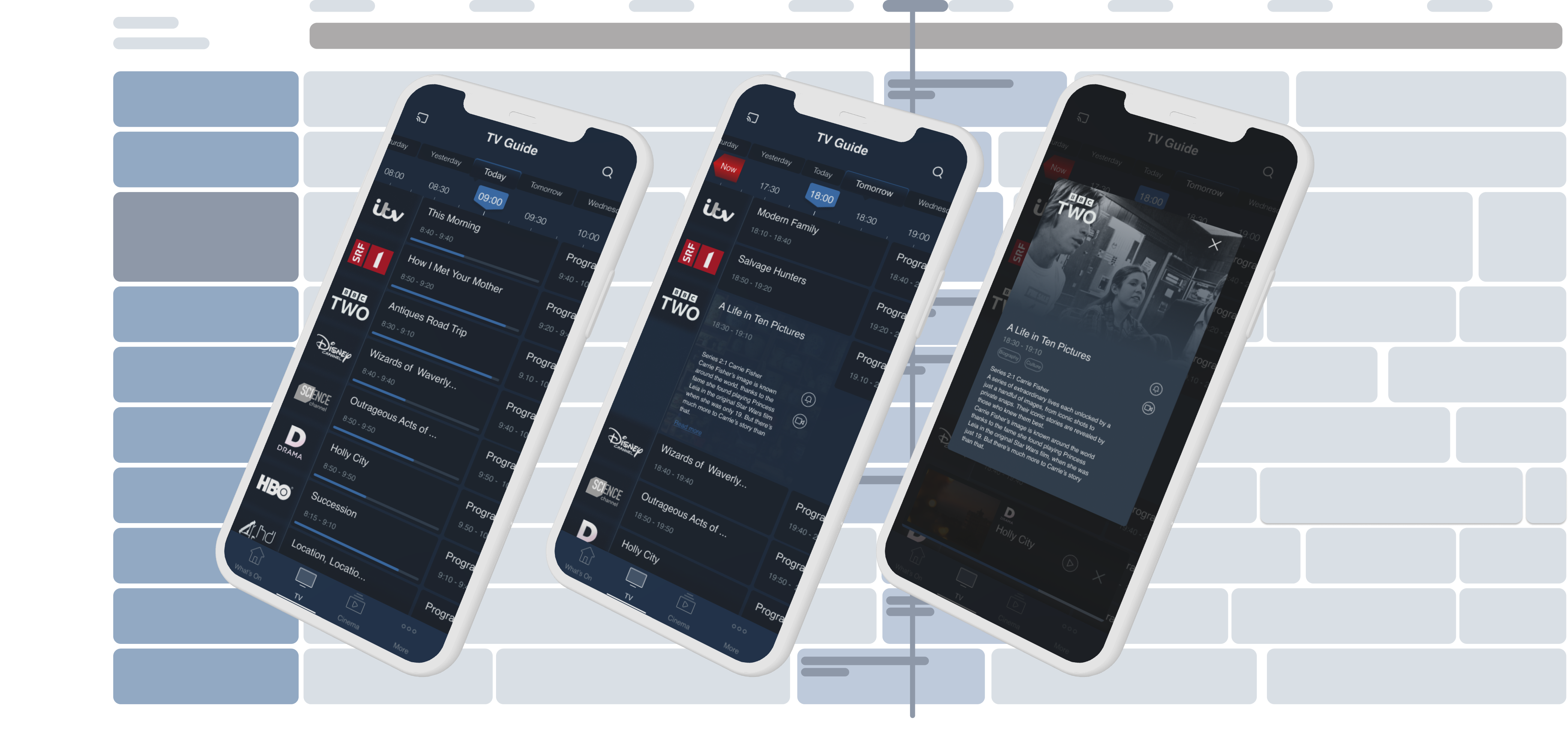
Usability testing with early prototypes produced four key findings.
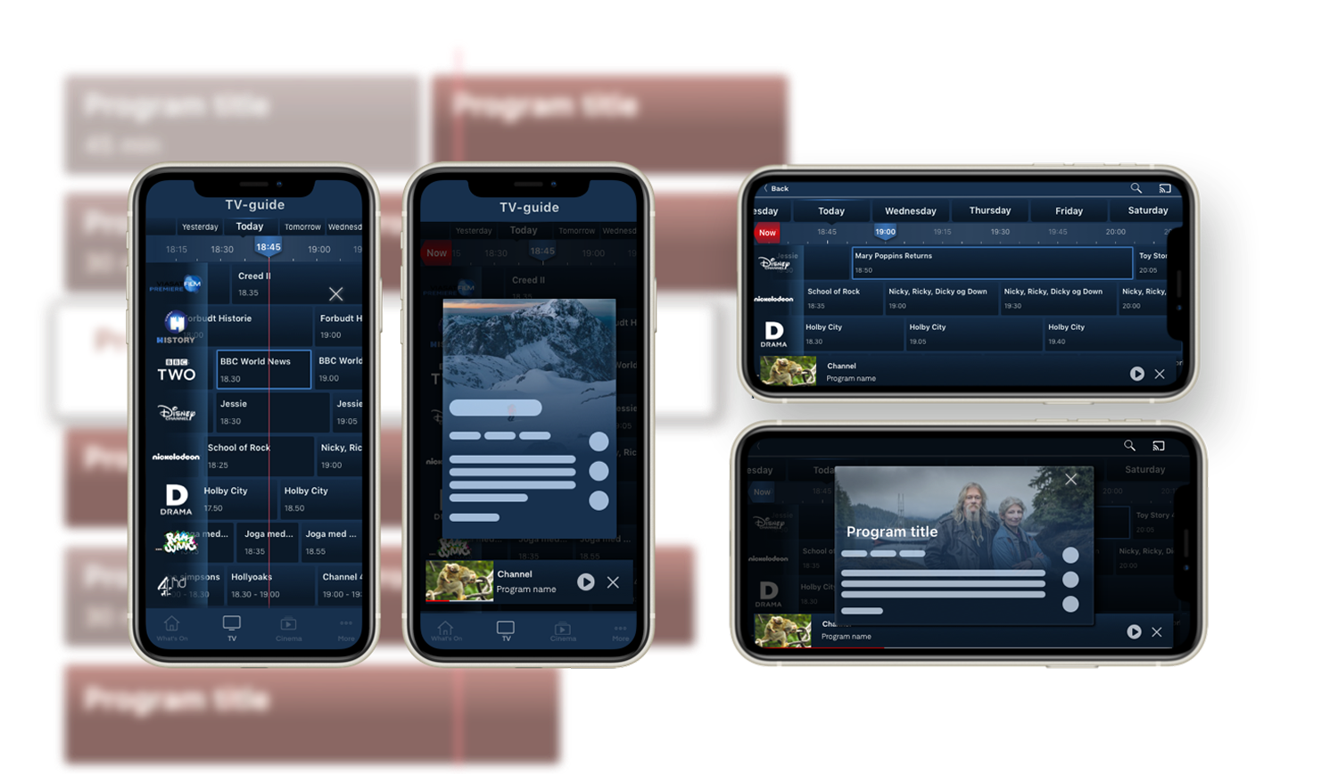
- Timeline comprehension: Users struggled to see how much of the current programme was left. The progress indicator needed to be clearer.
- Swipe preference: Users preferred swiping the timeline over tapping arrows.
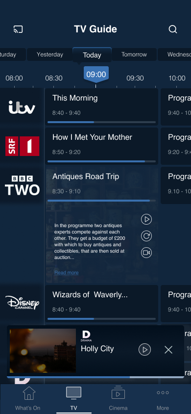
- Expansion panel: Users wanted programme details in-context, not on a separate screen.
- Missing "Now" button: After browsing past or future content, users looked for a quick way back to live. This feature was absent from both tested designs.
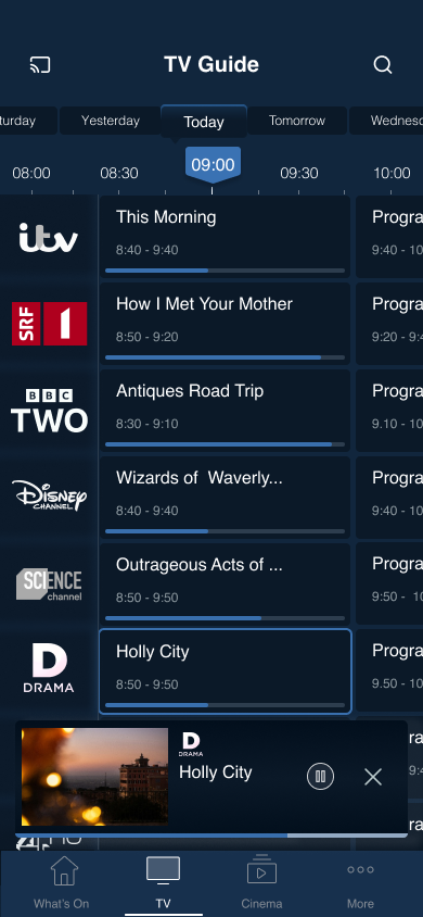
Early design prototypes tested with users: grid view, program info, and timeline variations
Decisions
Design decisions
Each decision traces to a testing finding. Nothing was added speculatively.
Swipe over arrows
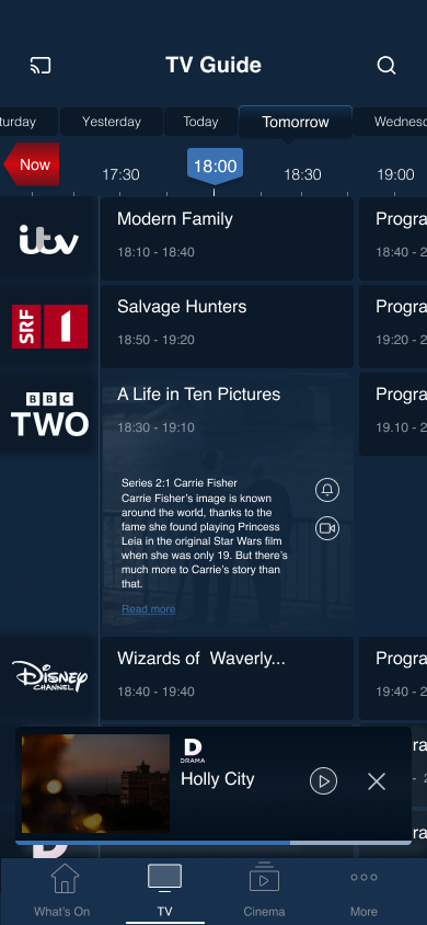
Replaced arrow buttons with swipe gestures for timeline navigation. Fewer taps, more natural on touch screens.
Unified tile sizing
Replaced proportional tiles with uniform sizing. Titles and air times are consistently readable regardless of programme length. Selecting a time shows all programmes in that window.
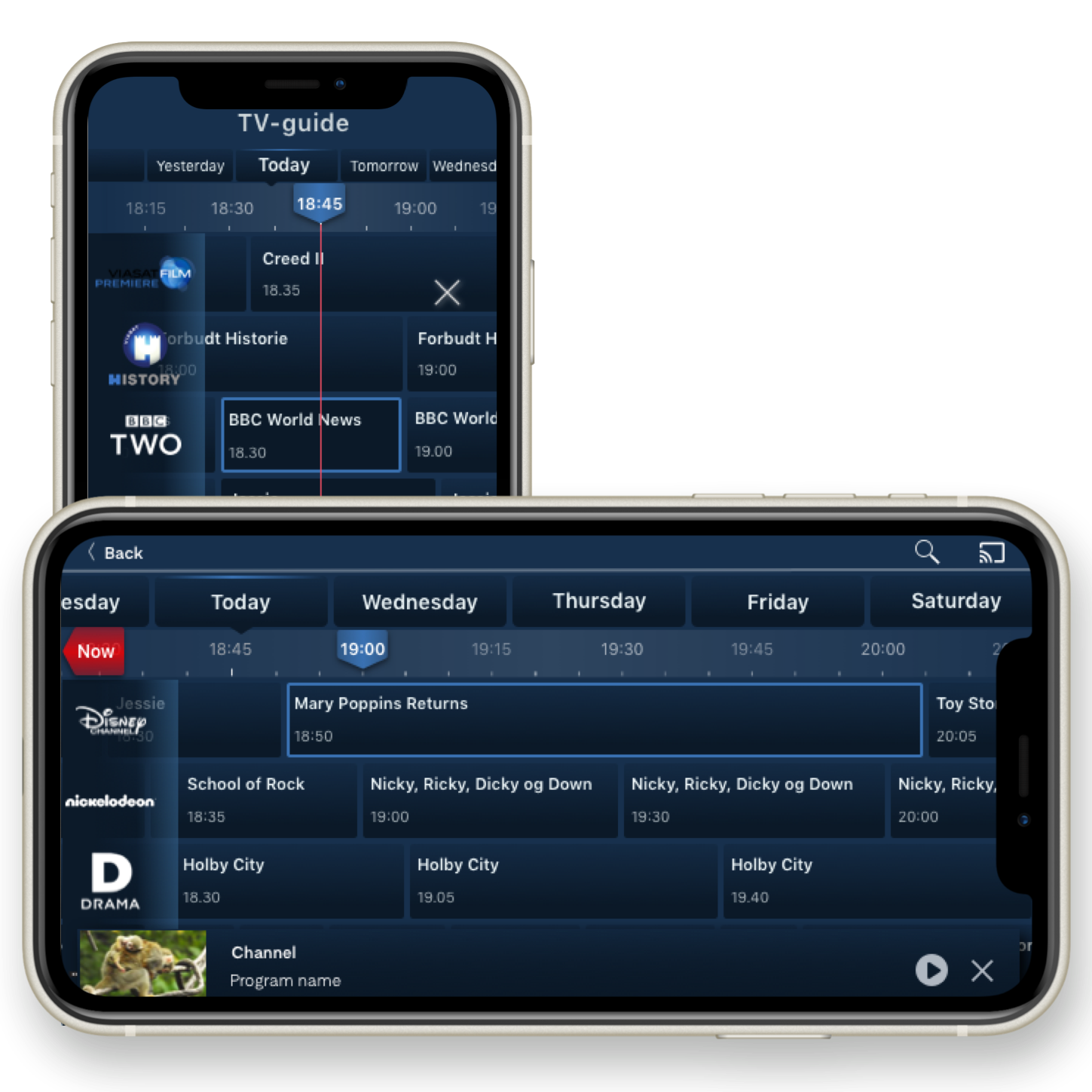
"Now" button
Persistent "Now" button in the timeline. One tap back to live programming after browsing past or future content. The most requested missing feature from testing.
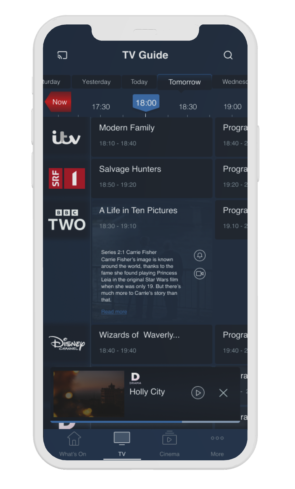
Progress line
Visual progress indicator across programme listings. Users see what is currently airing without reading timestamps.
Expansion panel
Tapping a tile shows a short description and quick actions: play, start over, record, set reminder. Full details expand in a modal. Guide stays uncluttered.
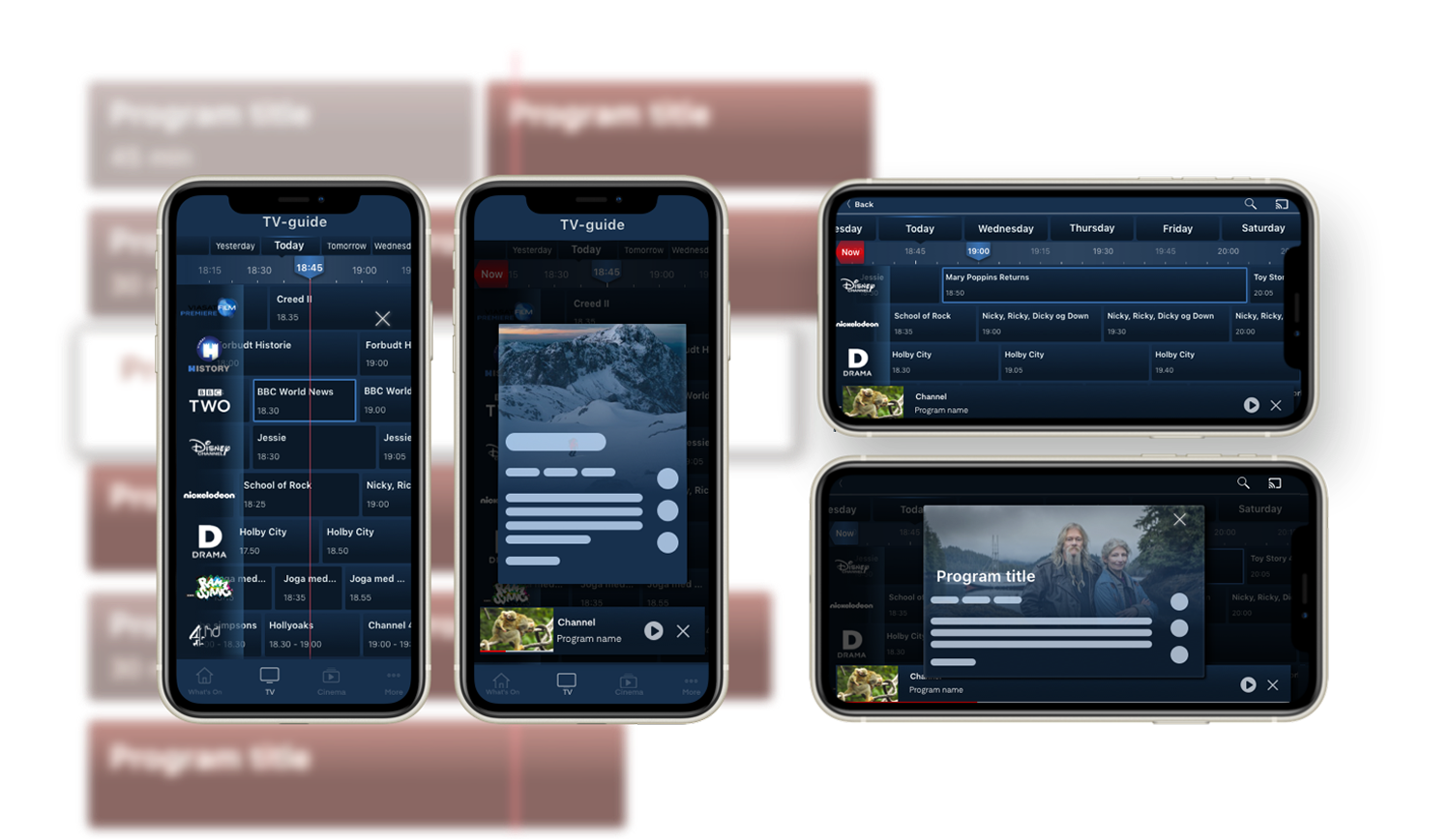
Landscape Adaptation
Portrait and landscape modes
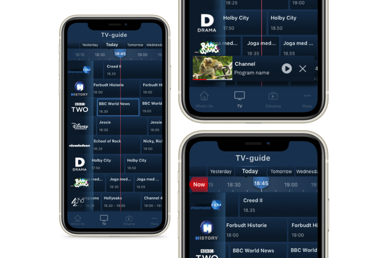
In landscape, the expansion panel was replaced with a modal preview. Programme details stay accessible without losing the guide layout.
Portrait views with guide and programme details (left), landscape views with player and guide (right)
Outcome
Results
The redesign addressed all six heuristic failures. Every shipped feature traced to a testing finding.
Swipe navigation replaced arrows. The progress line and "Now" button fixed disorientation. The expansion panel kept details accessible without cluttering the guide. Usability scores and user satisfaction improved across the board.
Before and after: legacy grid vs. redesigned EPG
Future Features
Next phase
Four features identified during research, scoped for the next phase.
Customisable preferences
Allow users to select favourite channels, preferred genres, and time slots surfacing relevant content without manual browsing.
Genre-based navigation
Build a browse surface around the mental model research surfaced: genre first, channel second. Scoped as a separate workstream.
Personalised recommendations
Algorithm-based suggestions built from viewing habits, reducing the need to browse cold across all channels.
Reminders and recording
Seamless integration for setting reminders and scheduling recordings. Already added to the library as a next step.
Next Project
All Projects →