Network Marketplace
Empowering enterprise users with custom coverage maps, simplifying IoT network management at Onomondo.
Context
Managing connectivity at scale
Onomondo provides global SIM connectivity for IoT businesses. This project improves network management, permissions, and cost transparency to their platform used by IoT device manufacturers, shipping companies, industrial operators operating across borders, and sending data.
Problem
A tool that couldn't support the decisions it was built for
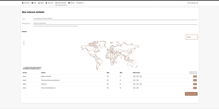
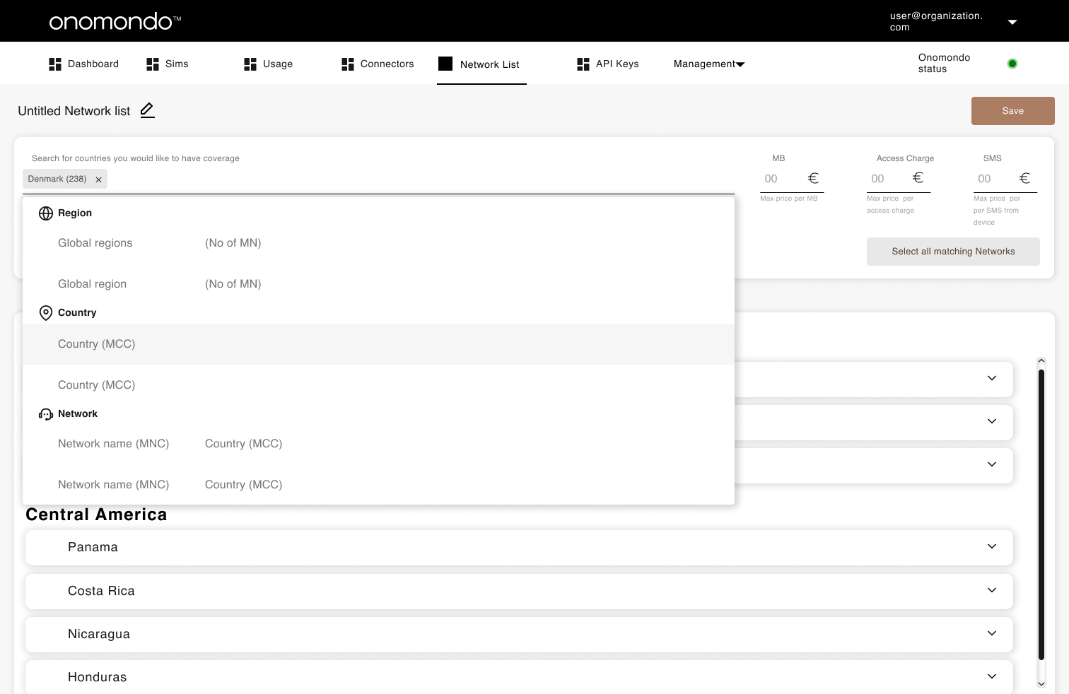
The interface relied on a map as the primary input for selecting networks,an approach that broke down as deployment complexity increased.
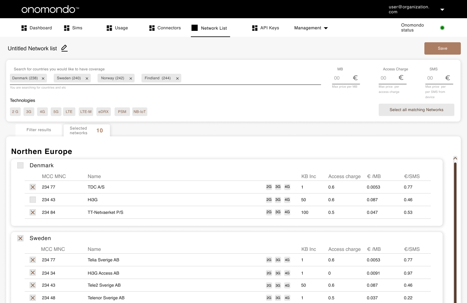
No selection overview
Users could not review selected networks across multiple countries before saving. There was no consolidated list of chosen networks.
Map interaction limitations
Small countries were difficult to select at default zoom levels. Editing required clicking precise country shapes, making updates slow and error-prone.
Missing cost transparency
Cost per MB, access fees, and data increments were not visible. Pricing information required contacting Customer Success.
Inconsistent interface
Inputs were misaligned. The country dropdown was right-aligned while all others were left-aligned, reducing clarity and discoverability.
Consistency and Standards
The networks added to a Network List are the ones used to send data, but the design is missing pricing information, making it difficult to differentiate and choose between them.
Recognition Rather Than Recall
- User has to recall where geographically each country is located.
- User has to remember the number of networks selected in each country.
- User has to access network pricing information by contacting Customer Success.
Help and Documentation
Users resort to contacting Customer Success for information about network pricing and restrictions, indicating a gap in the platform's accessibility and transparency.
Error Prevention
- User is not informed about the price or increments of networks when adding them to a list, which can result in higher than expected data cost.
- User is not informed about network restrictions in countries, which can result in unexpected loss of connection.
Map-as-input breaks on edit
The coverage map, rendered on open, became an obstacle rather than an aid. Users had to click precise country shapes to modify their list.
Dropdown ignored in favour of map
Users consistently bypassed the country dropdown, relying instead on zooming and clicking the map despite the dropdown being faster.
Ambiguous submission
The "Submit" button gave no indication of what would be saved, deleted, or changed, creating hesitation and errors.
No separation of create and edit
Both tasks used the same interface and interaction patterns, despite having entirely different intents and contexts.
Research
What users told us
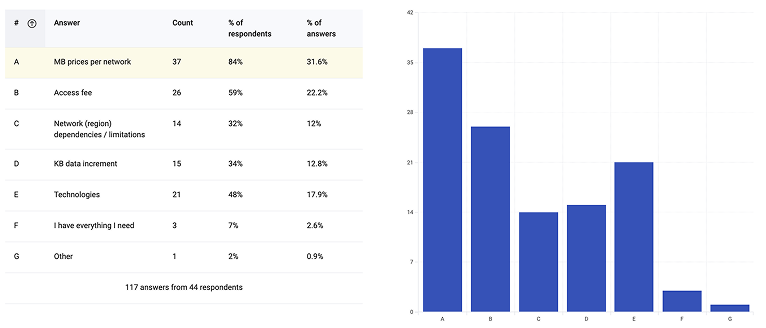
Five user interviews and a survey with 44 respondents uncovered a consistent theme: pricing was the most requested missing feature.
"I am trying to find out how much it costs to use the networks here. I need to download the rates so I can make smart choices about our data usage."
CEO / Operations Manager, interview participant
Hotjar in-app survey, triggered when users opened the Network List tab
Survey results confirmed that the information users needed to make decisions was simply not available in the system. The data directly shaped design priorities.
System Scope
Four connected systems
The solution spans four interconnected parts of the platform. Changes to any one area have downstream effects on the others which shaped every design decision in this project.
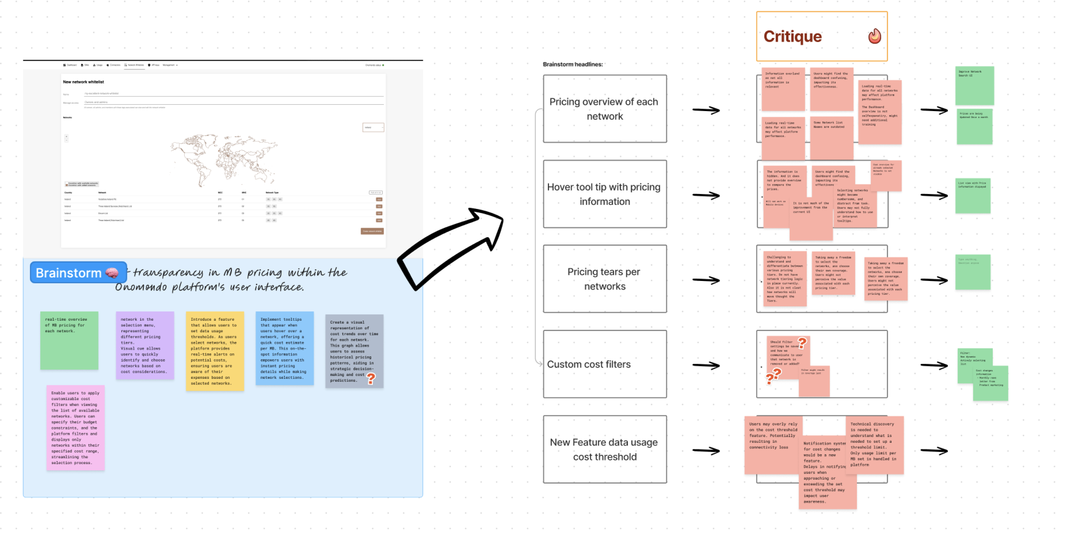
Brainstorm and critique session pressure-testing five ways to expose pricing in the interface.
Primary focus
Network List Management
Users build custom lists of permitted mobile networks, controlling which networks SIMs can register on globally. The core of this project.
Connected surface
SIM Management
SIMs are assigned to Network Lists. The network list attached to a SIM determines where and how that device can connect making list quality directly operational.
Connected surface
User Permissions
Controls who can view pricing, edit network lists, and manage access across teams and partner organisations. Pricing visibility is permission-gated by role.
Connected surface
Cost Overview Dashboard
Aggregates connectivity costs across devices, networks, and partners. The network choices made in the Marketplace directly determine what appears here.
Approach
From audit to tested design
Reframe
Separating two distinct journeys
The first step was recognising that "create" and "edit" were being treated as the same task in the existing interface but they have fundamentally different intents, starting states, and user needs. Separating them into distinct flows became the foundational design decision everything else built on.
This was an information architecture problem before it was a UI problem. The interface had no clear hierarchy: creating a list, editing one, and browsing available networks all competed in the same space, organized around geography rather than the decisions users were actually trying to make. Naming that structural gap was what made the rest of the redesign possible.
Explore
Early concepts and structural exploration
Explored list-first, search-first, and region-grouped structures to replace the map as primary input. Narrowed to two directions for usability testing.
Early concepts exploring list-first and search-first structures
Test
Think-aloud testing across four tasks
Users completed four tasks designed to stress-test navigation, selection clarity, and pricing discoverability:
- Create a Network List with Brazil, Serbia, and Denmark
- Choose the cheapest networks in the selected countries
- Name the new Network List and assign a tag
- Rename an existing network and assign a tag
Key findings: the search field was not recognised as the primary entry point, and the tab labels "All Networks" vs "Selected Networks" created confusion about what state the user was currently in.
The design tested in round one Brazil and Serbia networks with pricing visible per row
Iterate
Two rounds of refinement
After the first round of user testing, we uncovered several usability issues: input fields did not visually read as interactive elements, active states were unclear and easily overlooked, and users consistently forgot to name their network list before proceeding.
These findings drove three specific changes: the search field was redesigned to read as the primary action, tab labels were updated to reflect active state more clearly, and the separation between adding networks and reviewing the current selection was made structurally explicit.
A second round of testing confirmed the updated patterns resolved the navigation confusion and users could complete all four tasks without assistance.
Refined interface after iteration: search as primary action, clearer tab states, and explicit network selection separation
Key Design Decisions
Challenge, decision, outcome
Create and edit
Challenge
Both flows shared one interface, causing users to lose context and make errors when switching intent.
Decision
Split into two distinct flows with separate entry points, headings, and default states.
Outcome
Create: focused modal flow. Edit: dedicated page.
Step 1: naming and permissions as the first action in the create flow
Search
Challenge
Users ignored the country dropdown and tried to find countries by zooming the map missing small countries entirely.
Decision
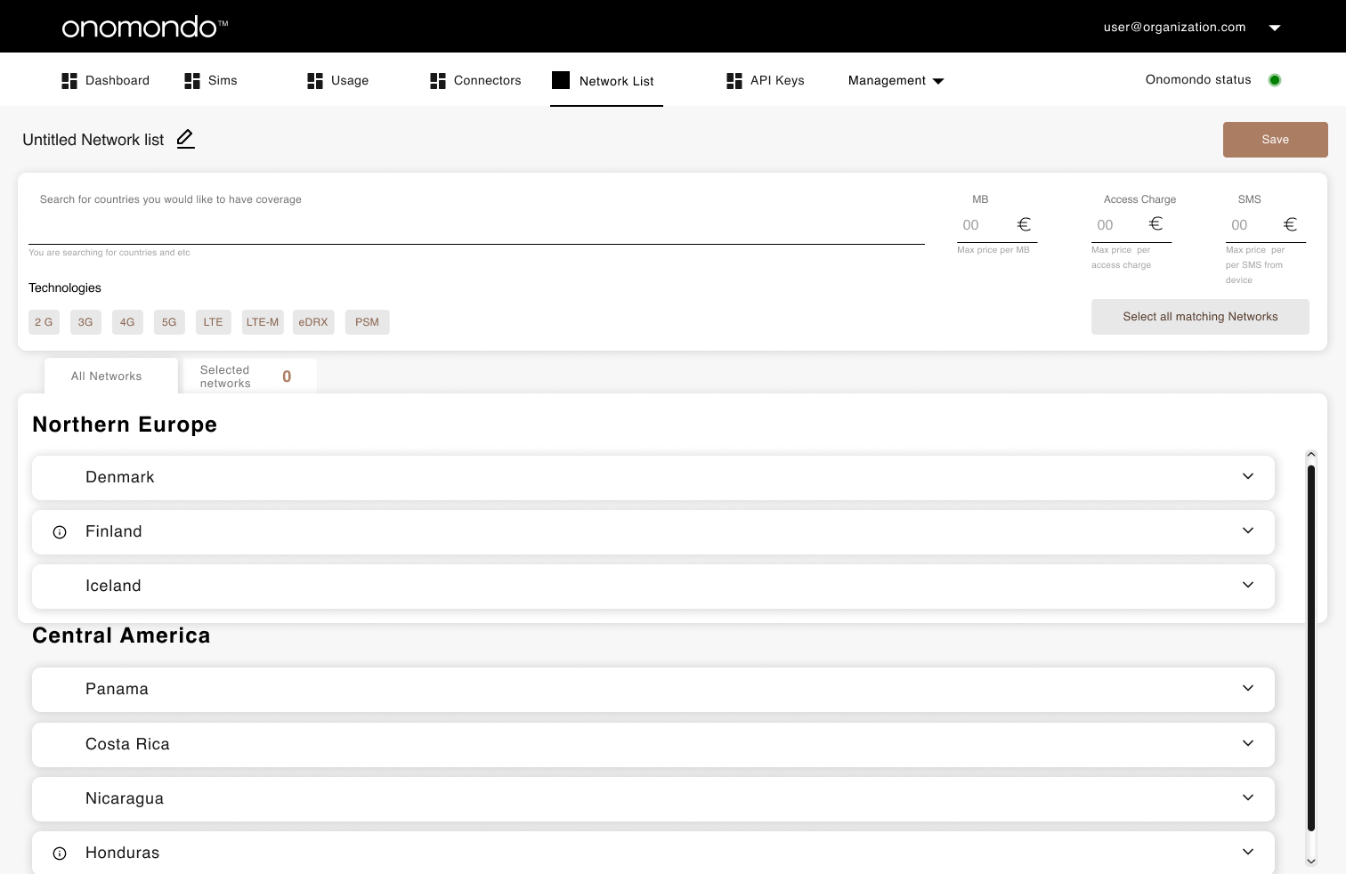
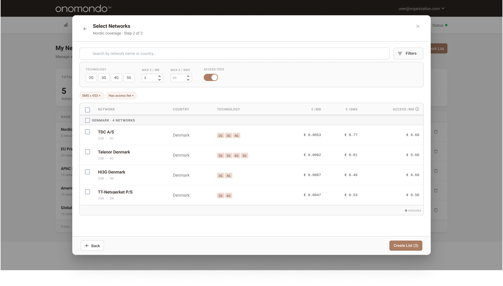
A prominent search field replaces the map as the main input, with filters for country, region, network name, MNC, and MCC.
Outcome
All countries, including small ones, became equally accessible. Filters were added as an optional tool, giving users control over long network lists without forcing a specific workflow.
Step 2: selection of networks, filtering is optional
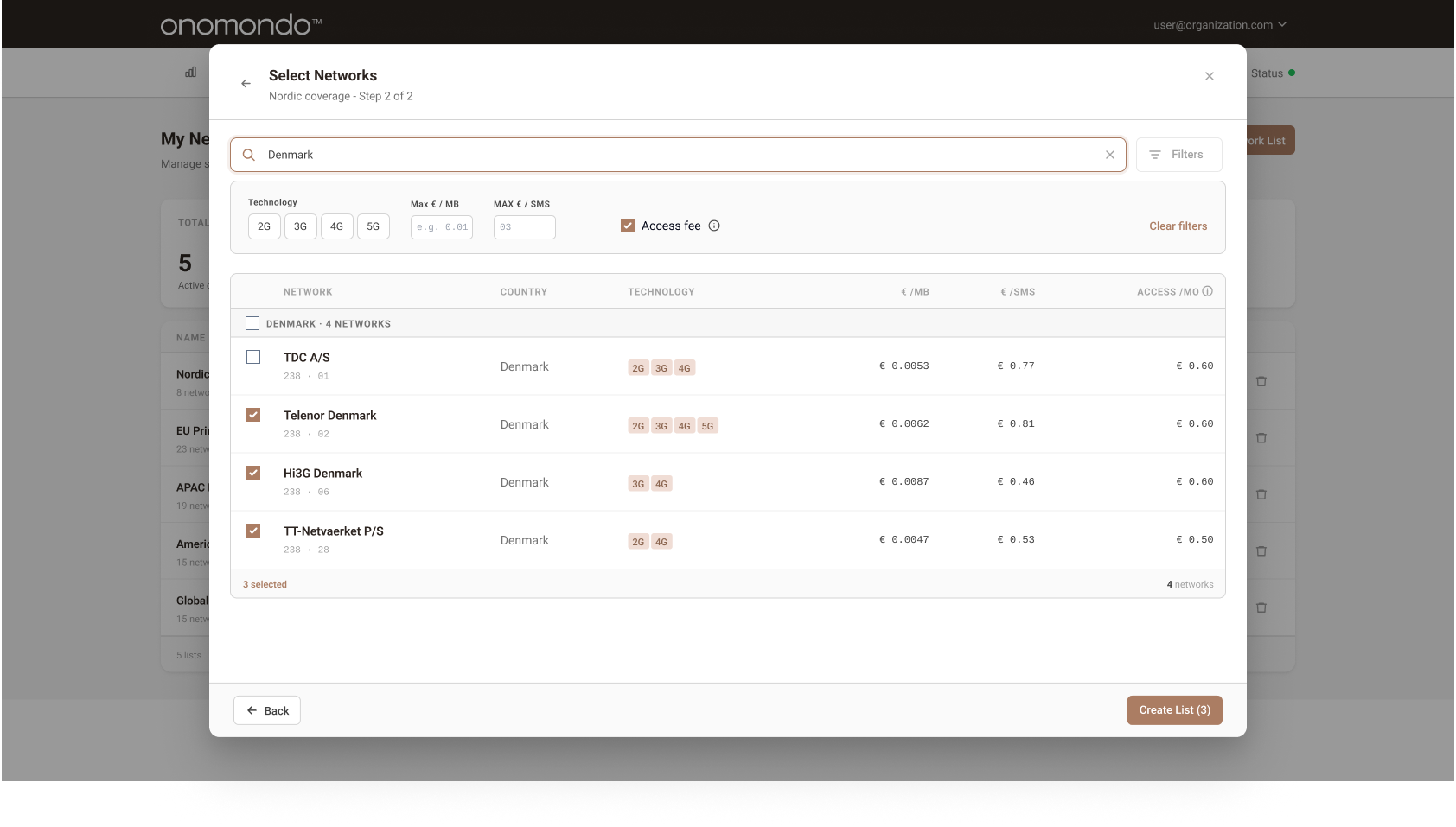
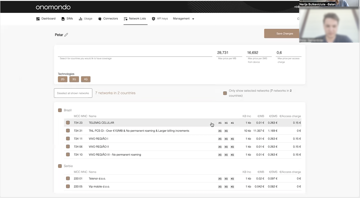
Filtered network list selection,users can narrow results by technology, pricing, and access fees
Pricing
Challenge
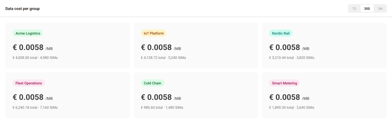
Pricing data was inaccessible,it existed only in Customer Success inboxes, not in the product.
Decision
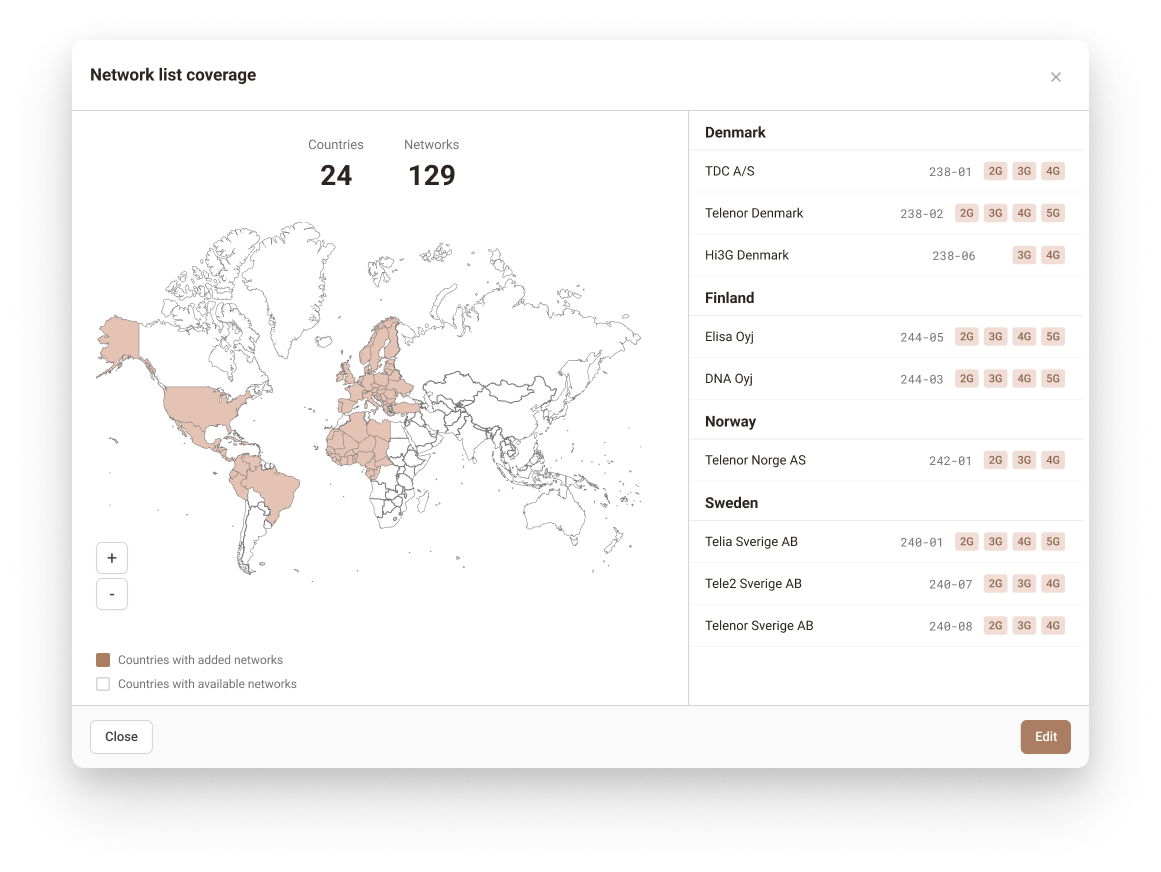
Network rates, access fees, and technology types displayed inline per network within the list. User permissions updated to control who can see and access pricing information.
Outcome
Support tickets about network cost rates decreased. Users could compare and choose without leaving the product, while pricing visibility remained controlled through role-based permissions.
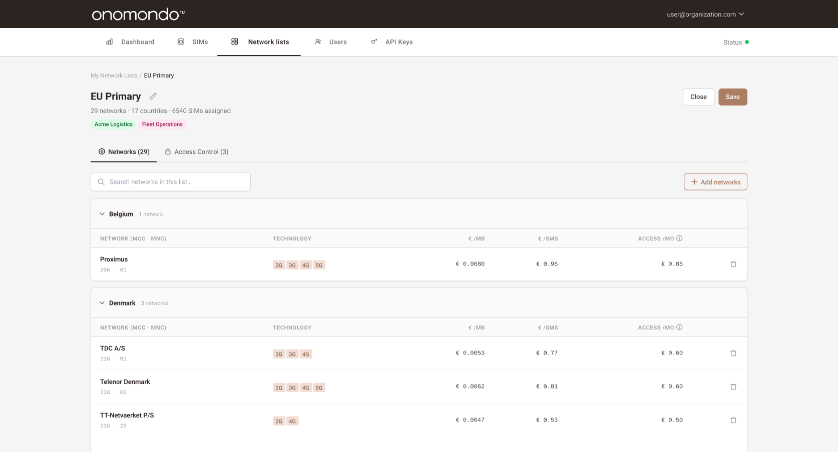
Review created network list,pricing visible inline with access control and permission management
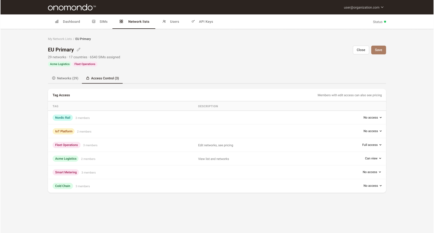
Access controls,user group permissions determine who can view, edit, and see pricing for each network list
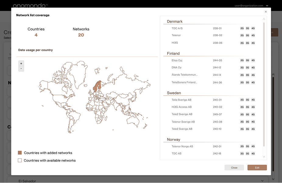
Map as overview
Challenge
The map was simultaneously the primary input and the only coverage feedback doing both poorly.
Decision
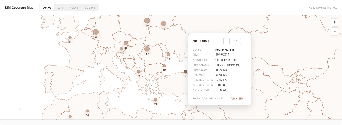
Map retained as a read-only coverage visualisation showing selected countries at a glance, no longer used as an input mechanism.
Outcome
Coverage at a glance without the friction of map-as-input. Users got spatial context without needing to interact with it.
Increased transparency to created lists
Challenge
Users had no overview of their network configurations, associated SIMs, or user group assignments without navigating into individual lists.
Decision
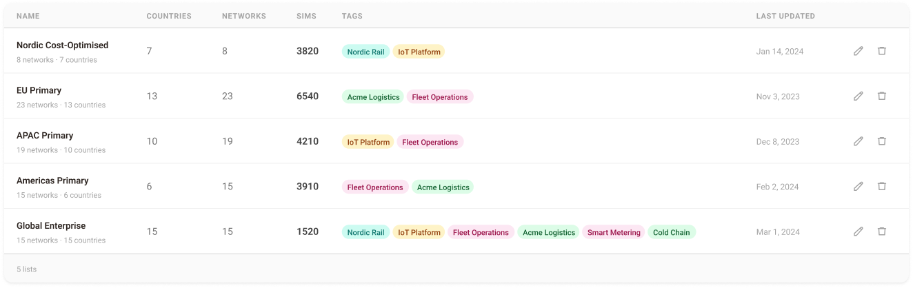
Redesigned the front page to surface SIM counts, user group tags, and configuration metadata directly in the list overview.
Outcome
Users gain immediate visibility into their network configurations without navigating into individual lists.
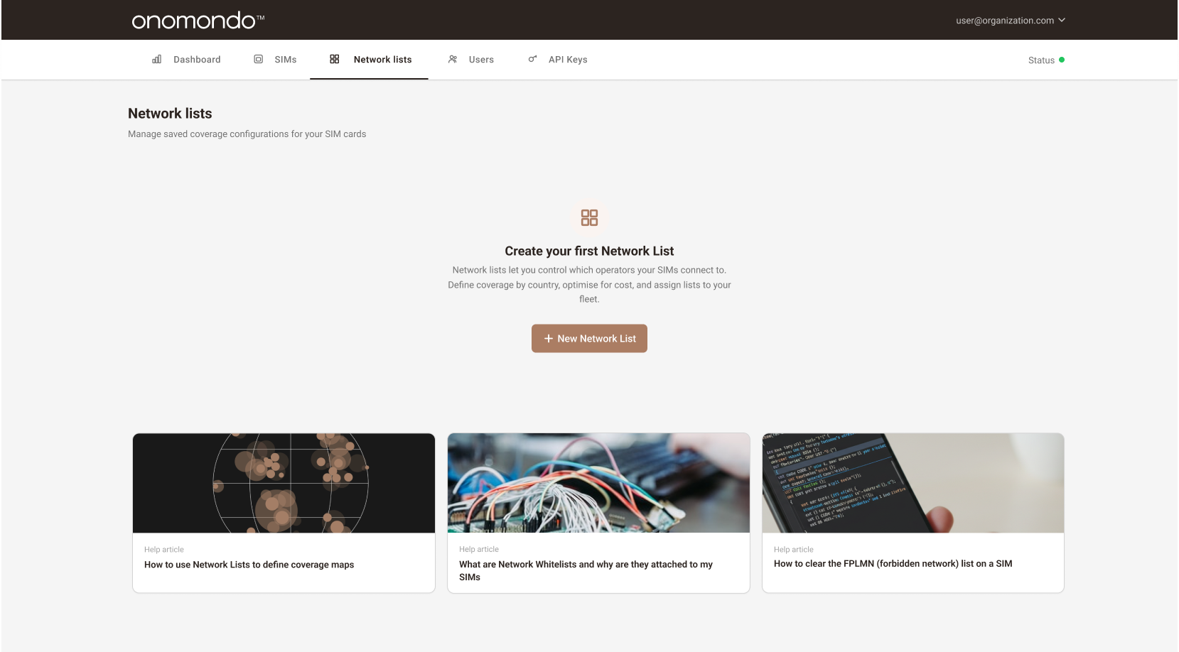
Empty state,first-time view before any network lists are created
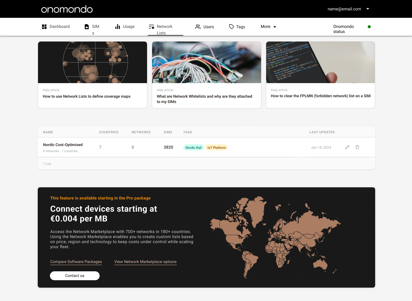
Network Lists page. One active list, help articles on top, Pro-package upgrade banner anchored at the bottom.
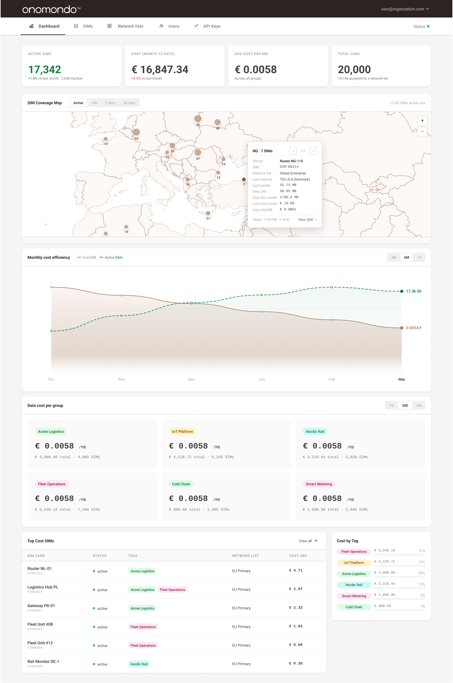
SIM cost dashboard providing real-time visibility into fleet size, activity, and monthly spend
Outcome
Impact
Shipping the redesigned Network Marketplace with transparent pricing and clearer navigation had a measurable impact on both user behaviour and the support team's workload.
↓ Support
Decreased support tickets about mobile network cost rates, as pricing is now visible inline.
↑ Engagement
More frequent visits to the Network Lists page, indicating the redesign aligned with how users actually work.
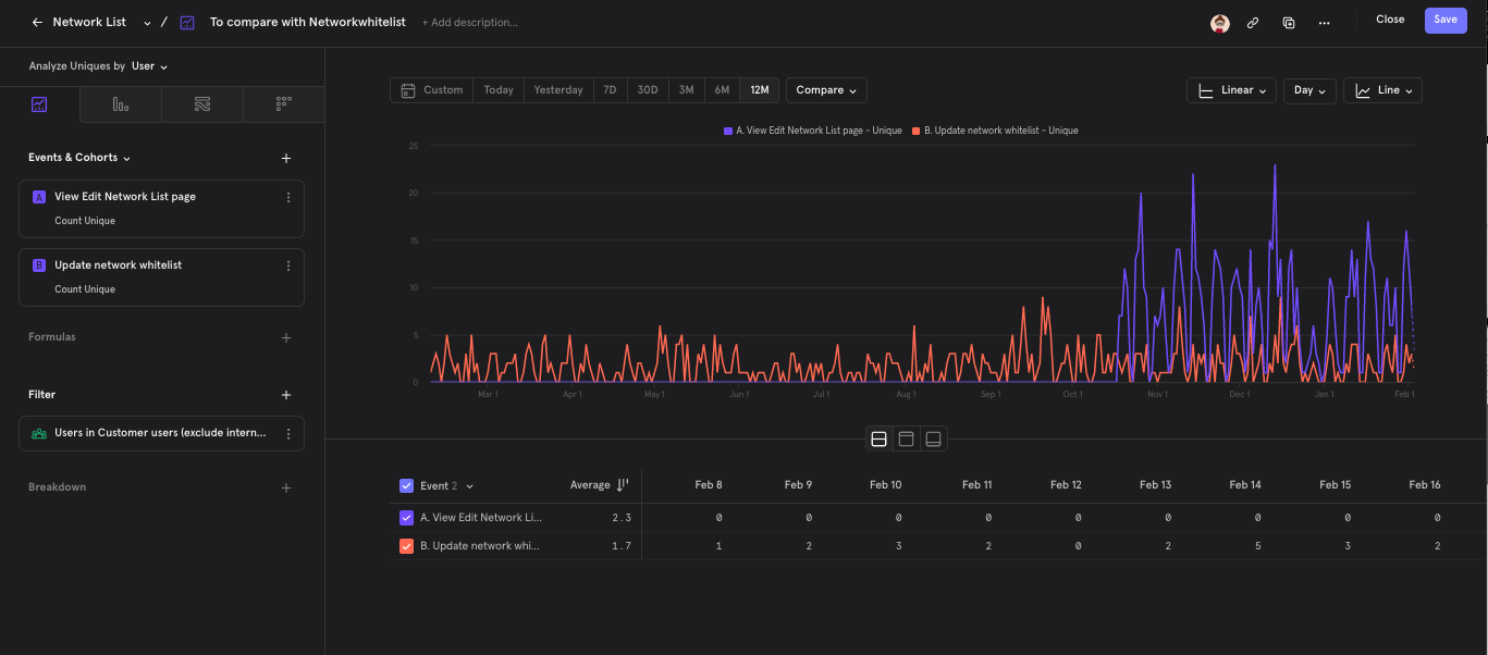
Customer-only unique-user activity over twelve months. Orange: Update network whitelist, the existing event for any whitelist change, tracked independently from app usage. Purple: View Edit Network List page, pageviews on the redesigned editing experience launched in October (the matching Cost API with pricing shipped later). The new UI was adopted without disrupting existing workflows.
Next Project
Electronic TV Guide →