Design System
2023 · Senior UX Designer · Onomondo
The component library behind the Onomondo IoT platform. Foundations, core components and the SIM-specific patterns built on them.
Foundations
Colour


Typography

Spacing

Shadow
shadow-xs
- Offset
- 0, 1
- Blur
- 2
- Colour
- Black 4%
shadow-sm
- Offset
- 0, 1 · 0, 2
- Blur
- 3 · 6
- Colour
- Black 4% · 6%
shadow-md
- Offset
- 0, 2 · 0, 4
- Blur
- 4 · 16
- Colour
- Black 4% · 8%
shadow-lg
- Offset
- 0, 4 · 0, 8
- Blur
- 8 · 24
- Colour
- Black 5% · 10%
shadow-dropdown
- Offset
- 0, 4 · 0, 16
- Blur
- 12 · 40
- Colour
- Copper 12% · Black 10%
shadow-modal
- Offset
- 0, 12 · 0, 32
- Blur
- 32 · 72
- Colour
- Black 12% · 16%
Radius
radius-sm
- Value
- 4
- Use
- Badges, checkboxes
radius-md
- Value
- 6
- Use
- Buttons, fields, notifications, tooltips
radius-lg
- Value
- 8
- Use
- Tables, menus, calendar, country cards
radius-xl
- Value
- 12
- Use
- Cards, modals
radius-full
- Value
- Full
- Use
- Pills, tags, switches, status dots, avatars
States
Hover. Neutral-100 fill, text darkens. Never a brand tint, so it cannot be read as selected.
Selected. The background and the text colour change. Menus, tabs, list options, table rows and cards: brand-100 fill, brand-900 text. Controls that hold a value, such as checkbox, radio, switch, segmented control and calendar day: brand-700 fill, white mark or text. Size and weight stay the same.
Focus. A 2px brand-500 ring with a 2px gap, on keyboard focus only. Outside the element, or inside it when items sit edge to edge, such as menu items and tabs.
Disabled. Neutral-100 fill, neutral-400 text. Not focusable.
Controls
Button


Link


Text input


Checkbox


Radio


Switch


Badge


Status


Avatar


Usage bar


Composites
Segmented control


Selection


Type-ahead


Calendar


Tooltip


Notification


Pagination


Toast


Patterns
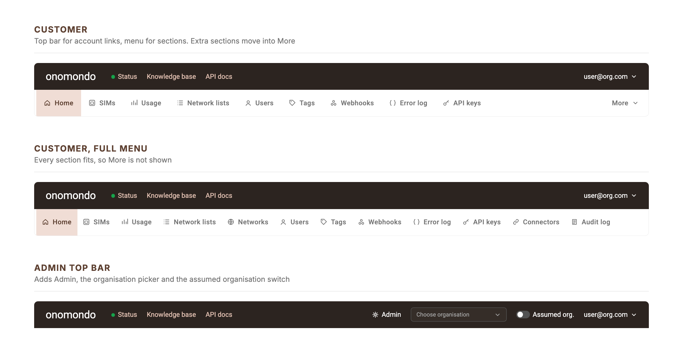
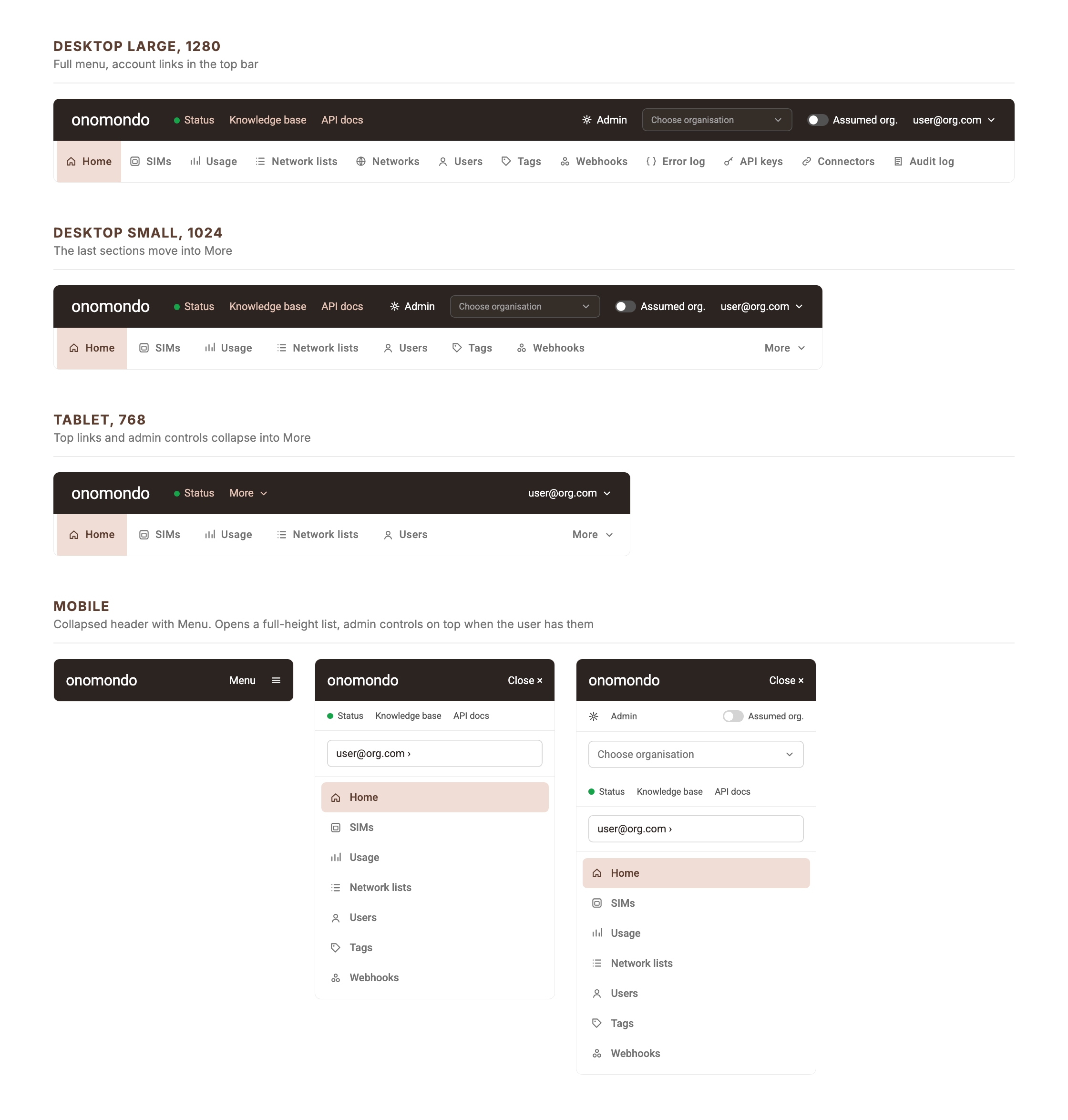
Navigation



Filter bar


Table


Chart


Map


Card


Modal


Layouts
Page layout


