Network Marketplace


Onomondo is SIM supplier, that helps to move data from physical device to digital domain.
Network marketplace allow the creation of custom coverage maps that suit the business needs of the customers. User creates a list: a group of selected networks that can be associated with SIMs to define which networks they are allowed to register on.
That means that it is possible to create network lists that provide maximum coverage for critical devices or keep costs low by removing expensive or unnecessary networks.
About company:
Network Marketplace:
With a focus on global connectivity, SIM management APP enables efficient communication across borders, empowering companies to streamline operations and enhance productivity.
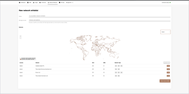
Evaluation of Old UI
UI Evaluation

User Control and Freedom:
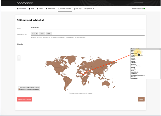
Navigating the map to add countries is challenging.
Users must scroll through a long list, making it time-consuming and inconvenient.
Zooming in and out frequently, especially for smaller countries, is a hassle and disrupts the user experience.
Users don't have a clear overview of the edits they've made in the Network List, making it difficult to track changes.
If a user exits the page without saving changes, there's no reminder, putting users at risk of losing their modifications.
Visibility of System Status:
No clear overview of the number of networks included in their Network List
No information about the quantity of networks present in each individual country
Match Between System and the Real World:
The visual communication is not clear - it is not obvious that it is needed to click on the country in order to display the networks available in that country.
It is not clear what “Submit” button means.
Consistency and Standards:
The Networks that are included to network list will be used to send data.
The design is missing pricing information making it difficult to differentiate and choose networks.
Recognition Rather Than Recall:
User has to recall where geographically each country is located.
User has to remember the number of networks selected in each country.
User has to access network pricing information by contacting Customer Success Team
Help and Documentation:
The user is not informed about the high price or KB increments upon adding them to Network list, this can result in higher than expected data cost.
User is not informed about network restrictions in countries, which can result in unexpected loss of connection.
User Research
User Interview Findings
In order to gather insights into user needs and preferences within the network selection process, we conducted a user research initiative involving five in-depth interviews and a survey. The interviews informed us into individual experiences and pain points.
Survey targeted a broader audience, allowing to understand common trends and patterns. Central to our research was the inquiry into the information users felt was lacking during the network selection process.
Here's what users have to say:


“I'm trying to find out how much it costs to use the networks here. I need the lowdown on the rates so I can make smart choices about our data usage and make sure it fits our budget. Also, I'm curious if there have been any recent price changes—keeping up with that helps me plan our expenses better.”
- CEO/ Operations Manager


“We (Onomondo customer) been tossing around the idea of enabling all the countries so we don't have to remember to do it when we move around. Can you break down what would happen if we go ahead with that? I'm worried we might end up with some crazy high costs, you know, just adding all these networks without thinking about the prices and what we really need in terms of connectivity. What's the deal with that?"
- CTO


“We (Onomndo customer) are planing to build a Network list for each customer in Onomondo portal for each customer and add these to the SIM when we program the device. We are still figuring out how much data each customer will use, so we could set data limit, and choose networks with me most sensible price.”
- Operations Manager
“I submitted a support ticket to obtain information on the average price per megabyte (MB) for data transmission via the network. Our deployments are planed in specific countries, including Algeria, Angola, Benin, Burkina Faso, Cameroon, Chad, the Democratic Republic of Congo, Congo, Gabon, Equatorial Guinea, Guinea, Ivory Coast, Madagascar, Mali, Senegal, and Togo.
Knowing how much it costs to send data in these regions is really important for planning our budget and making sure we use our connectivity budget wisely.”
- Operations Manager
“Our SIM card has been chowing down on data, and I really don't want us to get hit with a massive bill. Right now, it's hooked up to the Beeline network in Russia, but I'm struggling to find the rates for this operator. It would be super helpful to know how much it's costing us per megabyte.”
- Support Engineer

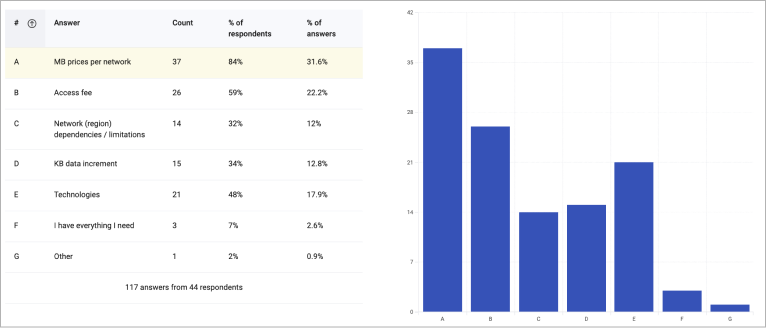
Survey conducted after customer interviews revealed common information gaps, the survey on the Network List page garnered responses from 44 users. Key findings included
Survey results:
MB Price per Network: 84% emphasize the need for transparency in MB pricing.
Access Fee: 59% prioritize understanding additional access fees.
Network Region Dependencies/Limitations: 32% seek clarity on geographical limitations.
KB Data Increments: 34% express interest in KB data increment details.
Technologies: 48% want to know about the technologies associated with each network.
I have all information: Only 7% feel they have all needed information.
Additional Information: 2% opt for an "Other" category without specifying.

Research results
The team has opted to incorporate pricing information directly into the UI. This addition aims to provide users with immediate access to pricing details, enhancing transparency and aiding in informed decision-making.
The use of tooltips will be reserved specifically for conveying network irregularities, ensuring that users receive focused and timely information about any anomalies.
Brainstorming Session
How can we meet the user demand for enhanced cost transparency, and what strategies can be brainstormed to effectively present pricing information in a clear and intuitive manner within the platform?"
How might we enhance the user interface to overcome challenges users encounter when navigating and selecting networks, particularly as the network list expands?

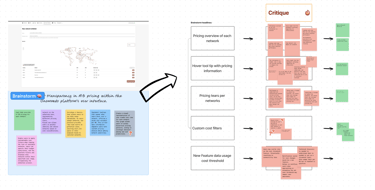
Participants:
Lead Developer
Product manager
UX designer
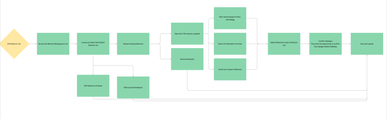
Two Distinct User Journeys
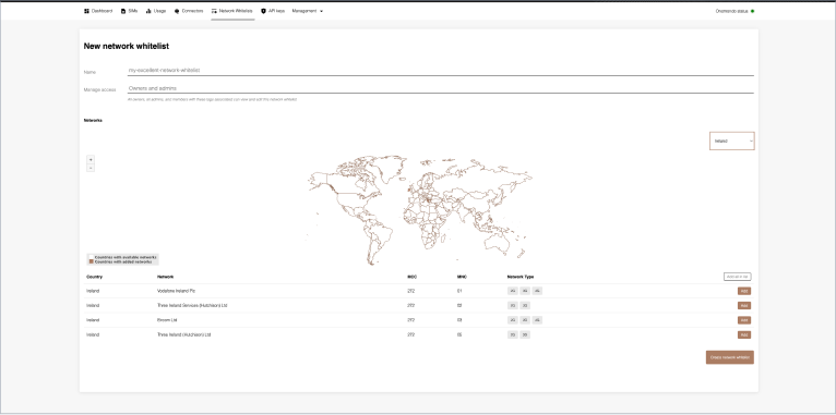
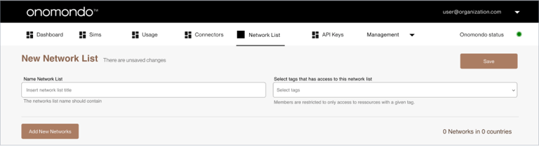
Create New Network List:
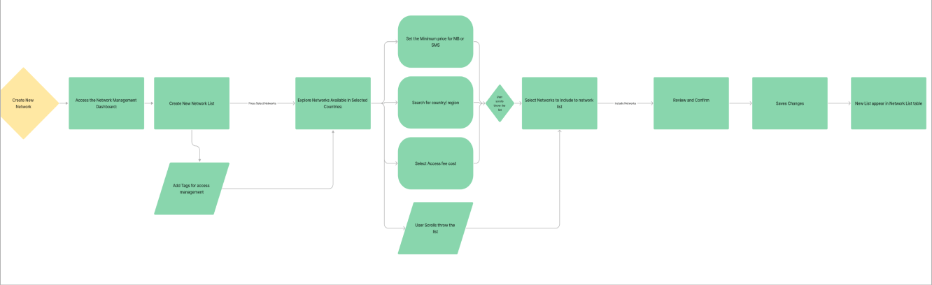

Edit Network List:
Design Phase
Addressing the challenge of accommodating two distinct user journeys within a unified interface where users can create new network lists and edit existing ones.
An essential constraint in the design process was the work within the framework of existing design components. This necessitated a strategic approach, leveraging established elements to maintain consistency throughout the interface.
User can create new network list or editing an existing one.
Users can switch between tabs, tailoring their interaction based on the specific network management task at hand.

All Networks Tab:
The first tab - labelled "All Networks" displays a list of all networks available for Onomondo customers. If the user have applied filtering, the tab label changes providing user with matching results only .
Users can seamlessly explore and choose networks suited to their preferences and requirements.
This list also helps user to compare the selected networks and the ones that are not included
Selected Networks:
The second tab, designated as "Selected Networks," offers a focused view, showcasing networks that have been specifically selected and included in the customer's list.
This tab serves as a reference point for users managing and editing their existing network selections.
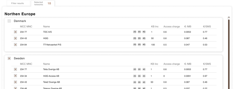
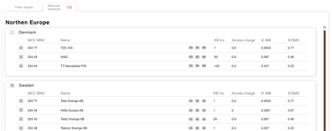
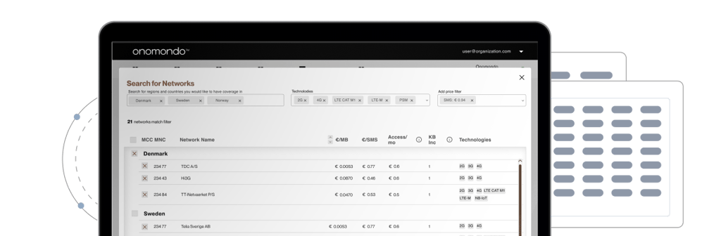
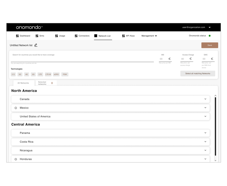
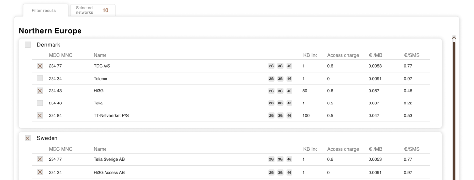
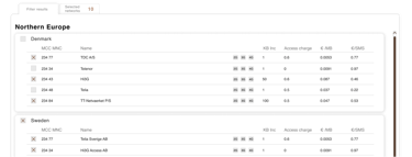
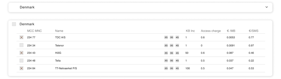
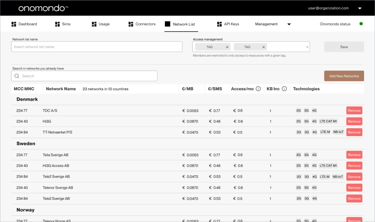
Structured Network List Display with Expandable Panels:
The network list is structured to enhance user comprehension and facilitate informed decision-making. Within this design, regions serve as a primary organisational unit, providing users with a comprehensive overview of the geographical distribution of available networks.
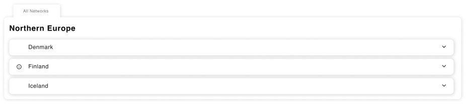
The country, positioned as an expandable panel beneath its respective region, acts as a granular focal point. Upon expansion, users are presented with a detailed breakdown of networks accessible in the selected country. Each network is accompanied by pertinent information, including rates and available technologies, empowering users to make informed selections tailored to their business needs.
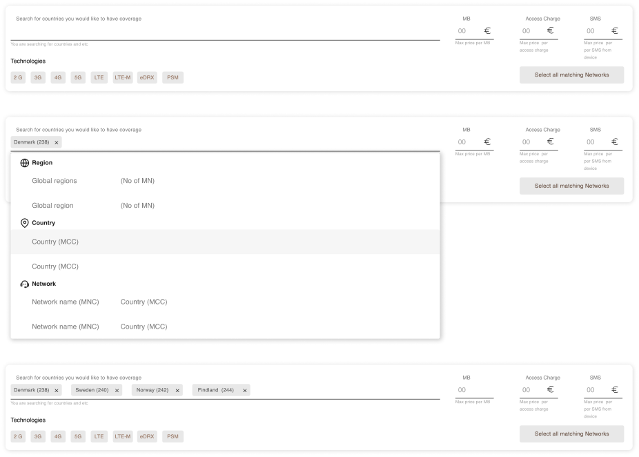
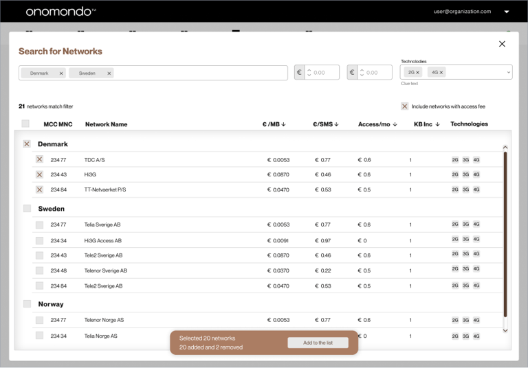
Searching for Networks:
Upon landing on the page, users see the search field, strategically positioned as the primary point of navigation.
Complemented by intuitive filters users are afforded a heightened sense of control over their network interactions.
The capability to search by country, region, network name, and input Mobile Network Code (MNC) or Mobile Country Code (MCC) enhances the precision and customisation of network selections.
The process of saving and managing newly created or edited network lists has been transitioned to a dedicated modal. Users are empowered to concentrate their attention solely on saving and managing their network lists, reducing cognitive load and enhancing the overall user experience.
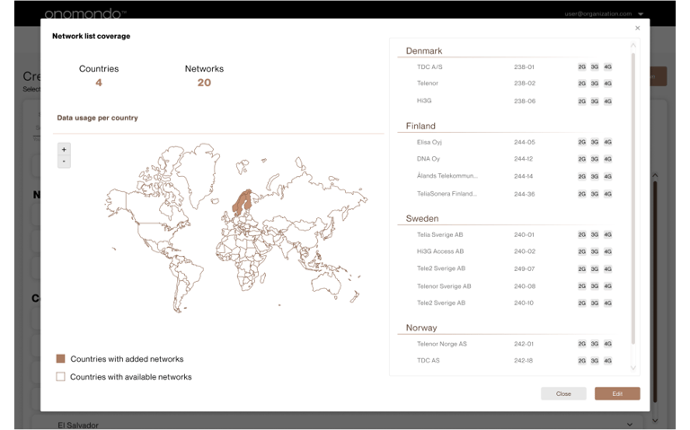
Furthermore, there was exploratored an idea to retain a map overview of selected countries. This feature serves as an informative aid, offering users insights into the coverage information of their Network Lists.
User Testing
Usability testing employing Think-aloud methodology
During the think-aloud testing, observations were made regarding user interactions, verbal feedback, and the overall user experience. These insights were critical in identifying pain points, user preferences, and areas of improvement within the UI design.

Tasks:
1. Create a Network List with chosen counties: Brazil, Serbia, Denmark
2. Choose the Cheapest Networks in Selected Countries
3. Name the New Network list and Assign a Tag
4. Name the Network and Assign a Tag
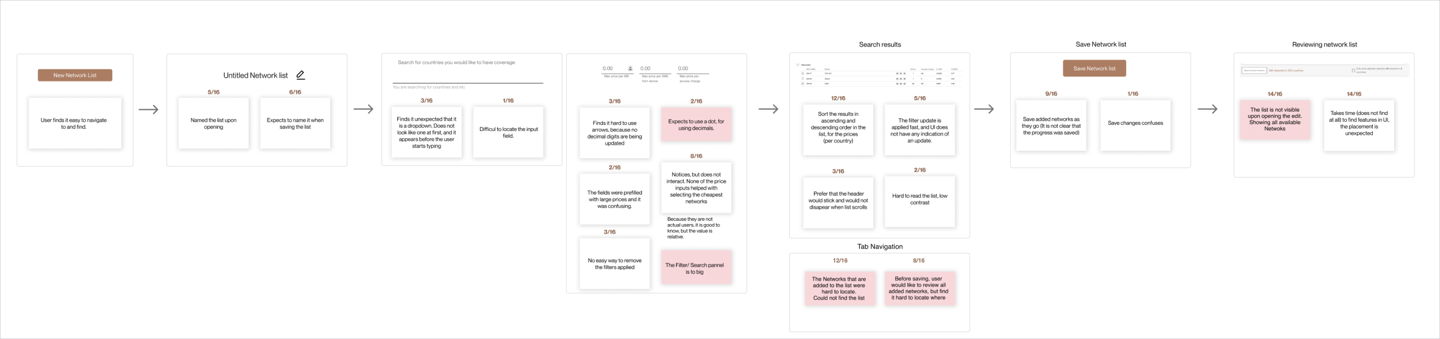
User Testing Takeaways:
Non-Intuitive Search Function
Users expressed difficulty in locating the search function, noting that it did not appear as a conventional dropdown. This observation highlights the need for a more intuitive and easily recognisable search feature appearance
Confusing Tab Navigation
Navigation between tabs proved to be confusing for participants. Streamlining and enhancing the tab-based interface to ensure clarity and user-friendly transitions emerged as a priority for improvement.
Adding and Reviewing Networks
Exploring a UI where user journeys are distinctly separated for editing, adding new networks, and reviewing network lists. It is a strategic approach to enhance user experience and streamline specific tasks. Here's how this separation could be beneficial:
Adding New Networks:
Upon initiation, the user is prompted to search for mobile networks to include in the newly created list. This step serves as the gateway for network selection.
Modal interface:
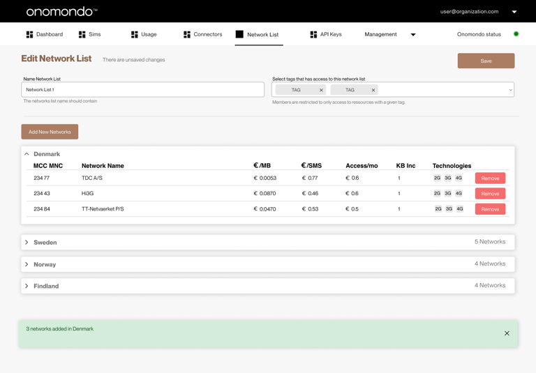
When users enter the editing mode, the UI transitions seamlessly to a distinct interface tailored for modifying existing network lists. This dedicated space allows users to make adjustments, add networks or remove networks. The user can compare network prices and coverage information in this step.
Within the modal, users have search and filter options. This functionality allows for a streamlined exploration of networks, facilitating quick identification based on specific criteria.
New List Overview:
The selected networks are added to the list overview, providing the user with a clear visualization of the curated network list.
Users can effortlessly switch between tabs, tailoring their interaction based on the specific network management task at hand.

Re-testing takeaways:
Search Option
Missing Search Option on Existing Network Lists:
Users expressed a notable difficulty in locating the search option when interacting with already created network lists. The absence of this feature posed a challenge in efficiently navigating through existing lists and identifying specific networks.
Annoyance with Expansion Panel:
The expansion panel, designed to reveal additional details, was identified as a source of annoyance for users. This element hid the information that was relevant for user to have a quick overview of networks included in the list and their pricing.
Expansion Pannel
Introduce Search Functionality for Existing Lists:
A prominent search field has been introduced, providing users with a straightforward and efficient way to search for specific networks within already created network lists. This addition addresses the previous difficulty users encountered in locating networks.
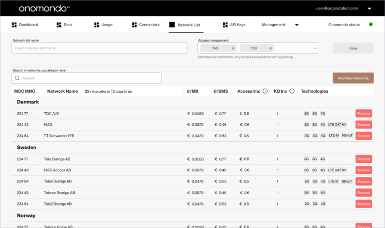
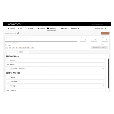
Removal of Expansion Panel:
The expansion panel, previously associated with additional details, has been removed. This decision aims to streamline the interface, allowing users to have a clear and unobstructed overview of all networks in an existing list. With the removal of the expansion panel, users now have a comprehensive and clear overview of all networks in the existing list. The primary function is to facilitate the removal of networks, streamlining the process of modifying and managing network lists.
Impact
The clarity provided by Network Lists has led to a decrease in support tickets regarding mobile network cost rates. Users now have access to comprehensive pricing information, minimizing the need for additional assistance.
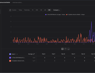
Reduced Support Tickets:
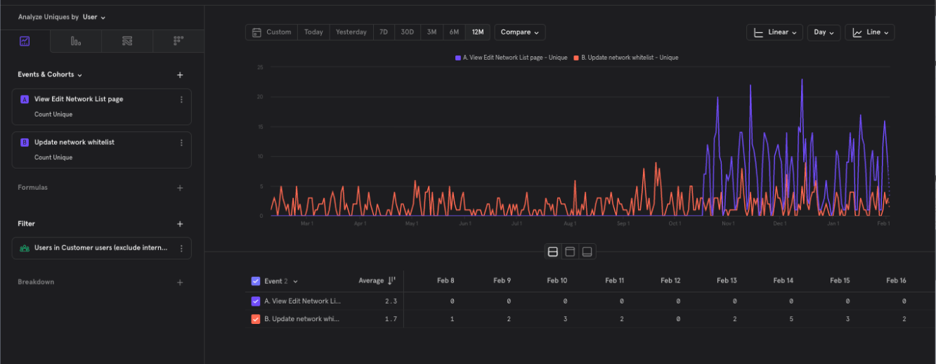
Increased User Engagement
With users visiting the Network Lists page more frequently, it indicates heightened engagement and utilization of the feature. This suggests that the enhanced functionality aligns with user needs and encourages regular platform interaction.
View other projects
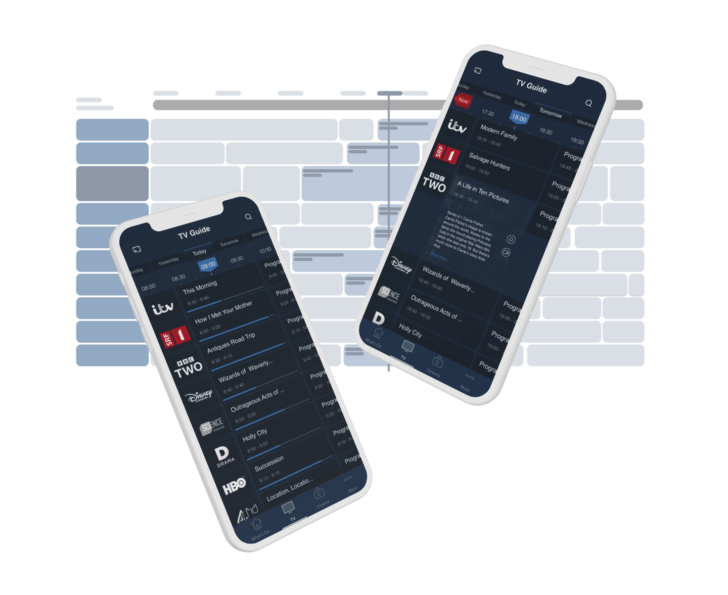
Revamping the Electronic Program Guide
This project aims to optimize the Electronic Program Guide (EPG) interface, enhancing user experience through intuitive navigation and comprehensive program information.
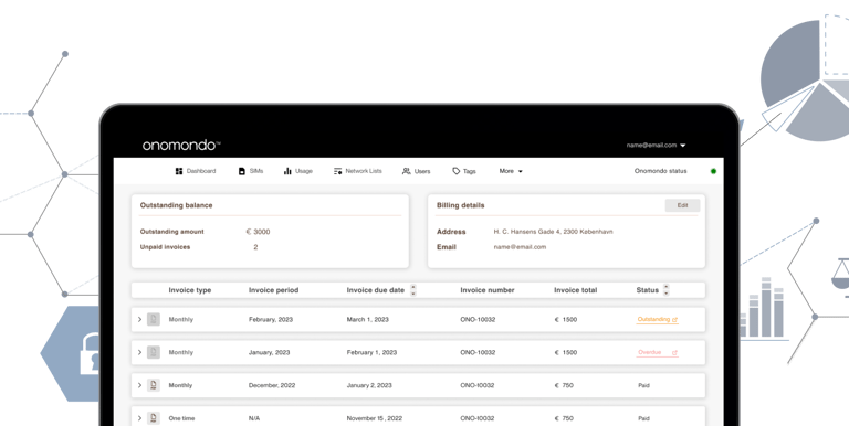
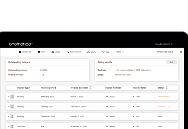
Invoice Overview
The SIM management portal lacked a dedicated section for handling payments related to Onomondo products and SIM card shipments.